Evolving a government service brand without losing its users
The constraint wasn't just the design system. It was the expectation that comes with a government URL.
Problem Statement
Crown Commercial Service manages government procurement on behalf of the entire UK public sector. The website serves three fundamentally different user groups: buyers navigating commercial frameworks, suppliers seeking contract opportunities, and corporate users managing agreements and compliance, all within a single public-facing service.
The existing site had been built incrementally on the GOV.UK Design System: accessible, functional, and unmistakably government. What it wasn’t was distinctively CCS. As the organisation matured commercially, the question became whether the website could develop a visual identity of its own without compromising the trust signals that make a government service legible to its users.
The constraint wasn’t just the design system. It was the expectation that comes with a government URL. Users need to trust the service. The design had to evolve the brand without losing that trust.
Your Role and Process
The work was prototype-first: rapid iteration through the GOV.UK Prototype Kit, each decision documented and systematised before anything was proposed for the live product.
The kit made global changes fast. SCSS variables meant a primary colour swap propagated across the entire prototype in minutes. Multiple layout configurations could be instantiated and compared without engineering cost. The prototype behaved like a real service—real navigation, real content, real interaction—which meant research findings were trustworthy rather than filtered through the gap between a wireframe and a working product.
Multiple header variants were built for research: a standard version, a beta variant with the phase banner, a hero version integrating search into the header, and dropdown-capable navigation. Each variant was available for parallel testing so navigation decisions could be grounded in evidence rather than preference.
Design Solutions
The colour problem
The most significant single decision on this project was what to do with the primary brand colour.
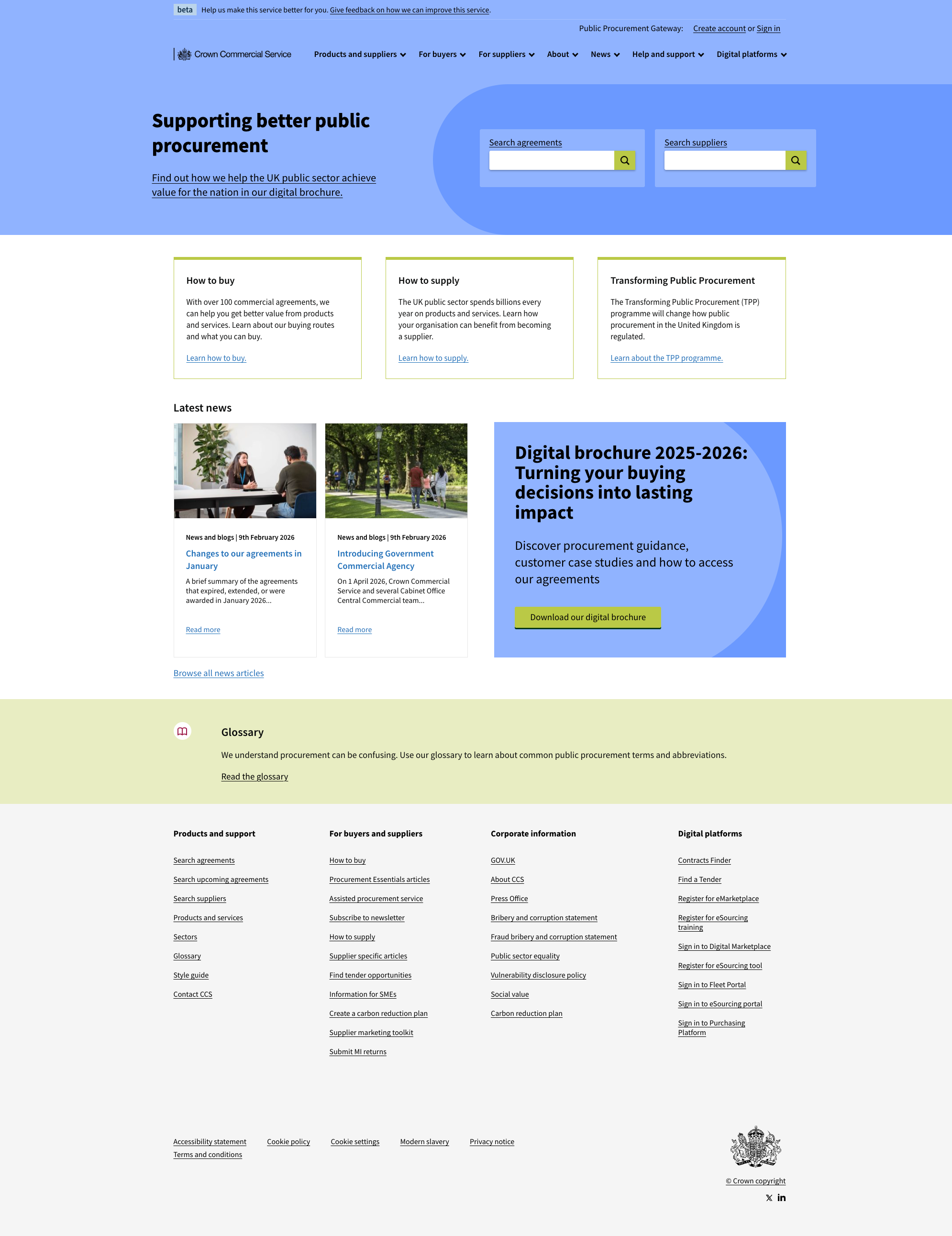
The existing CCS identity was built around a deep burgundy. It had presence. It was visually distinct. But presence isn’t the same as the right signal. Burgundy communicates authority and heritage, exactly the correct register for a formal institution, but CCS is primarily a service. Its users need to trust it, not be impressed by it.
The shift to Cornflower Blue (#699AFF) was a deliberate repositioning. Blue is the dominant trust signal in digital products. It is what users associate with reliability and safety: the colour of banks, NHS services, and government portals. For a platform handling procurement decisions worth billions annually, that association is not incidental to the design. It is the point.
But changing a primary colour is not a colour decision. It is a system decision.
Building the semantic colour system
The move from burgundy to blue created an opportunity to address a structural problem in the existing palette. The site had previously used four pillar colours that operated independently of each other and of the primary brand colour. The result was a site that could look visually incoherent depending on which section you were in.
The new system replaced the ad hoc pillar colours with four semantic roles, each assigned to a distinct brand value:
Cornflower Blue is the primary: navigation, headers, trust indicators. Sapling Green handles progress and success states. Vibrant Yellow is reserved for attention. Professional Claret replaces the legacy burgundy in a demoted role. Each colour was tested against WCAG 2.1 contrast requirements.
Redesigning navigation
The existing navigation had two rows of links competing for attention. The redesign restructured into primary and secondary tiers. Primary links serve core content (agreements, suppliers, buyers). Secondary links serve utility (account, search, help). Mobile was designed independently, not retrofitted: the toggle uses explicit aria-expanded state, touch targets meet the 44px minimum, and the full brand-blue background keeps CCS identity intact in the dropdown.
The footer taxonomy
The footer redesign started from an information architecture problem, not a visual one. The existing footer reflected organisational structure rather than users’ navigational needs. The new structure organised content into four logical groupings: Products and support, For buyers and suppliers, Corporate information, and Digital platforms. The visual treatment shifted to a light grey footer on dark text—clear and functional, meeting WCAG AA.
The before and after
The visual difference is clearest at the page level: the header shifts from burgundy to cornflower blue, the navigation consolidates from two competing rows to a single organised tier, and the footer opens up from a dense two-column block into a structured four-column layout.
Outcomes and Metrics
Tested brand system. Colour, navigation, and global UI patterns built as a working prototype and documented for implementation. Twelve component and foundation specifications covering colour, typography, spacing, buttons, cards, navigation, and footer.
Traceable rationale. Each specification included exact hex values, contrast ratios, spacing constants, and implementation-ready code. Design decisions were traceable to their rationale.
Implementation-ready. The colour system moved the primary identity from authority to trust. The navigation gave primary and utility tasks distinct, researched homes. The footer gave users a taxonomy that reflects how they think about the service, not how the organisation is structured. The prototype kit documentation remains the specification of record for the brand system.
Related reading
- Colour from burgundy to blue — The colour decision and its rationale
- The prototype kit as design tool — Building and iterating in code before production