Five iterations to a calculator that makes procurement value legible
Procurement value isn't one number. This tool makes the distinction legible, auditable, and comparable.
Problem Statement
CCS manages commercial agreements used across the entire UK public sector. Buyers using those agreements are expected to demonstrate the value they deliver, but there was no standardised, accessible way to do that. Reporting was inconsistent, terminology was unclear, and comparing performance across organisations or against sector benchmarks was effectively impossible.
The brief was for a calculator: a service that could take a buyer through the process of identifying what they’d saved, how they’d measured it, and how that compared to similar organisations. The complexity was that procurement savings don’t mean one thing. They mean several things, and conflating them produces numbers no one trusts.
Your Role and Process
Five iterations. Each round was shaped by what research revealed users actually needed, rather than what the initial brief described.
Early versions focused narrowly on the calculation itself: a linear form collecting a baseline value and an actual spend, producing a savings percentage. Research quickly showed that shape was wrong. Procurement professionals do not work in a fixed sequence. They have contract details before they have savings figures, or strategic value documentation before the cashable numbers are finalised. Forcing a fixed path created friction without improving data quality.
The decision to use a task list over a linear wizard came from that research. So did the separation of cashable from strategic value: conflating them would undermine the whole purpose. Each iteration introduced changes informed by user behaviour—pre-population from the Central Digital Platform, Excel template upload for teams who already maintained spreadsheets—and each was tested before the next.
Design Solutions
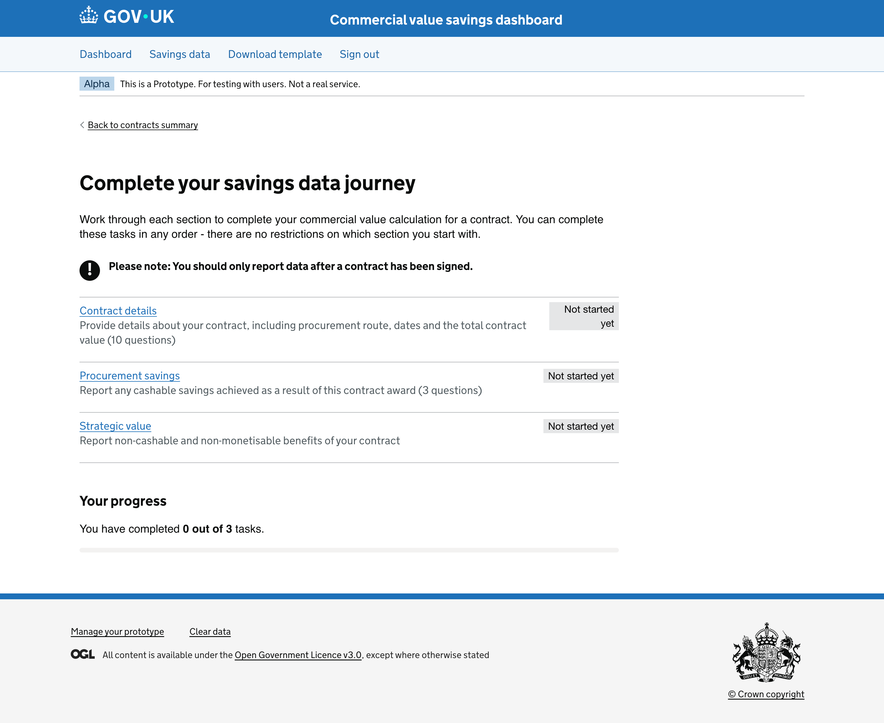
Task list over linear wizard
The GDS task list pattern was chosen because it mirrors how procurement professionals actually work: not necessarily in sequence, and often returning to sections as information becomes available. Each section has independent status tracking. Users see their progress at a glance and can prioritise or defer accordingly. When the entire flow is complete, a “Review and submit” action becomes available, not before.
The tool guides buyers through three distinct types of value, each captured in its own section:
Contract Details (10 questions)
Contract ID, name, procurement procedure, CCS agreement and lot, supplier, contract dates, total value. The factual record that contextualises everything else.
Procurement Savings (3 questions)
Cashable savings against a defined baseline. The tool captures whether savings were achieved, the savings type, the baseline approach, and the baseline value.
Strategic Value (non-cashable benefits)
Cost avoidance, social value, risk reduction, sustainability outcomes. Benefits that don’t appear in a savings figure but are real, captured and surfaced separately from cashable savings.
Separating cashable from strategic value
The clearest structural decision was refusing to collapse all savings into a single number. Strategic value (carbon savings, social value, risk reduction) is real benefit that doesn’t appear in a cost comparison. Giving it its own section, with its own completion status, signals that it matters while keeping it structurally distinct from cashable savings data. The two types inform different decisions and should never be aggregated.
Pre-population from CDP
Contract award notice data that the Central Digital Platform already holds about an organisation is pulled in automatically. Users answer only the questions for data that isn’t already available. The task list surface communicates which steps have been pre-filled and what remains, rather than silently skipping questions.
The dashboard
The output is not a single figure. It is a view into how a buyer’s procurement activity performs in context. The dashboard visualises savings performance over time, across contracts, and against peer organisations. The box plot chart, built with D3.js, shows the distribution of savings percentages across four baseline comparison methods. Users can view their results against all organisations, their own history, or a configurable peer group. Benchmarking by methodology, not just outcome: 12% against budget is a different claim to 12% against market rate.
Excel template upload
Research revealed that many procurement teams already maintained savings data in spreadsheets. Re-entering it manually was a meaningful barrier to adoption. A second data entry path, an Excel template upload, was added to remove that friction.
Outcomes and Metrics
Production-ready tool, fifth iteration. The tool reached production in its fifth iteration and is proceeding to live service.
Accessible to procurement professionals. The iterative process produced a service that works for users regardless of technical familiarity.
Three distinct types of value captured. Cashable, forecasted, and strategic value are structurally separate; the numbers stay honest and defensible.
Benchmarking previously impossible. Insights that were effectively impossible to generate consistently across the public sector are now available.
Related reading
- Task list over linear wizard — Why procurement tools need flexible flows
- Separating cashable from strategic value — Keeping three distinct types structurally separate