100% task completion on a mission-critical trade platform
Before designing a single screen, we mapped every dependency. That decision shaped everything that followed.
Overview
NCTS5 — the New Computerised Transit System — facilitates the movement of goods between the UK, Northern Ireland, the EU, and other partner transit countries. The deep cross-border data requirements drive complex business logic and validation rules for every single transit movement.
The service was used by freight forwarders, customs agents, and traders to declare goods in transit across international borders. Each declaration contained nested data structures, conditional logic, and interdependencies that could change based on a user’s answers at any point in the journey.
The stakes were high. Errors in declarations have real consequences: delays, fines, goods held at border. The users were domain experts — professionals who understood international trade law — but the interface was making their expertise irrelevant by failing them at the interaction level.
We were brought in as Phase 5 of the programme: a significant redesign of the most complex parts of the service, working alongside a development team building the live product in parallel.
The ecosystem: a sprawling web of stakeholders
The service sits at the intersection of countless stakeholders. Internal dependencies involve HMRC, Border Force, and legacy government gateways. External users range from individual traders to massive hauliers and third-party software developers. Every UI decision ripples across this map.
The Common Transit procedure spans borders and jurisdictions — any change to a pattern, a validation rule, or a journey structure had downstream consequences across the entire ecosystem. Understanding that landscape before starting design work was not optional. It was foundational.
Mapping the territory before touching a tool
The first thing we did was not open a design tool. Before any wireframe, any component, any prototype, we built two artefacts that would guide every decision that followed.
Service map first. We mapped the landscape: who the users were, what they needed to accomplish, how the service connected to upstream and downstream systems, what the regulatory dependencies were. This gave the whole team a shared picture of the territory before anyone started drawing paths through it.
Then The Model. A formal diagram of every information dependency and branching condition in the service. Which questions triggered which others. Which answers changed what a user would see later. Where conditional logic meant two users completing the “same” journey might follow entirely different paths.
The complete system revealed a dense architectural logic: sprawling decision trees dictating Route Details, Guarantee, and declaration data for every movement across multiple jurisdictions.
The Model became the guide to building an accurate, fully functional prototype. Without it, we would have been prototyping assumptions rather than the actual service. With it, every prototype screen was grounded in the real dependency structure.
Design philosophy: shielding users from systemic complexity
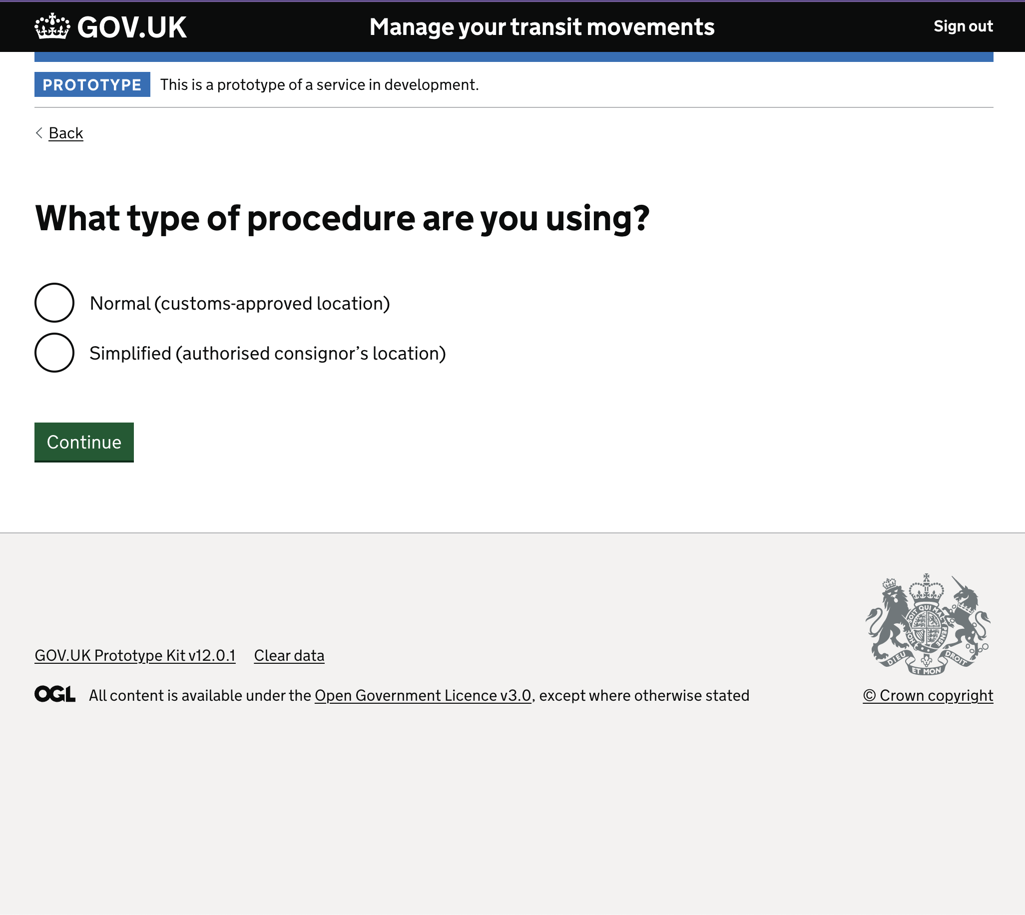
The primary design objective was cognitive relief. We took the fragmented, multi-stakeholder legal requirements and distilled them using the GOV.UK “One Thing Per Page” philosophy.
The interface acts as a protective layer — guiding traders through the labyrinth one simple question at a time. The system’s complexity is real and unavoidable; the user’s experience of that complexity is not.
The pre-task list: orienting before starting
Before anything else, users needed orientation: what they were about to do, what information they would need, and what the shape of the journey looked like. The pre-task list answered those questions before asking for input.
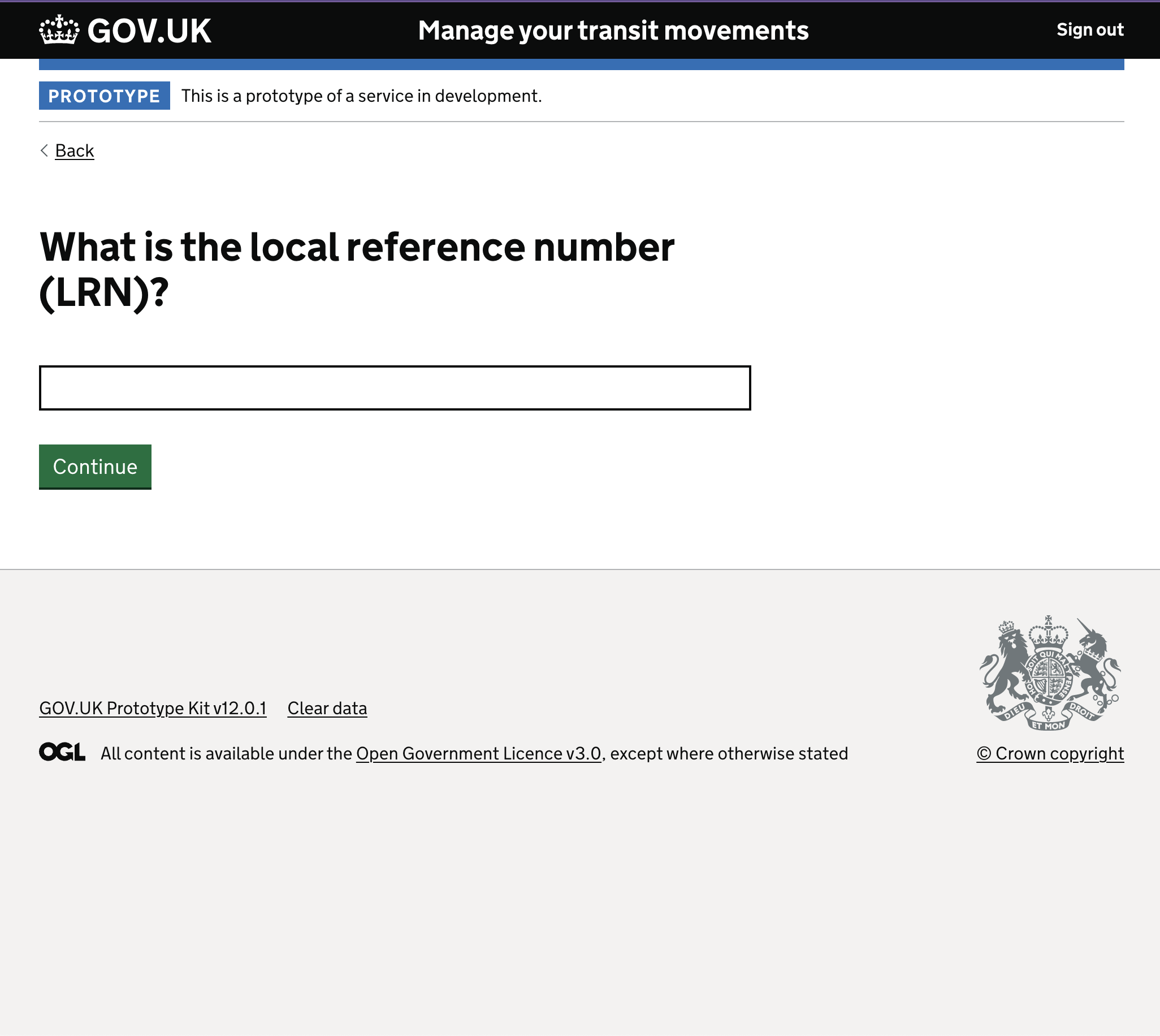
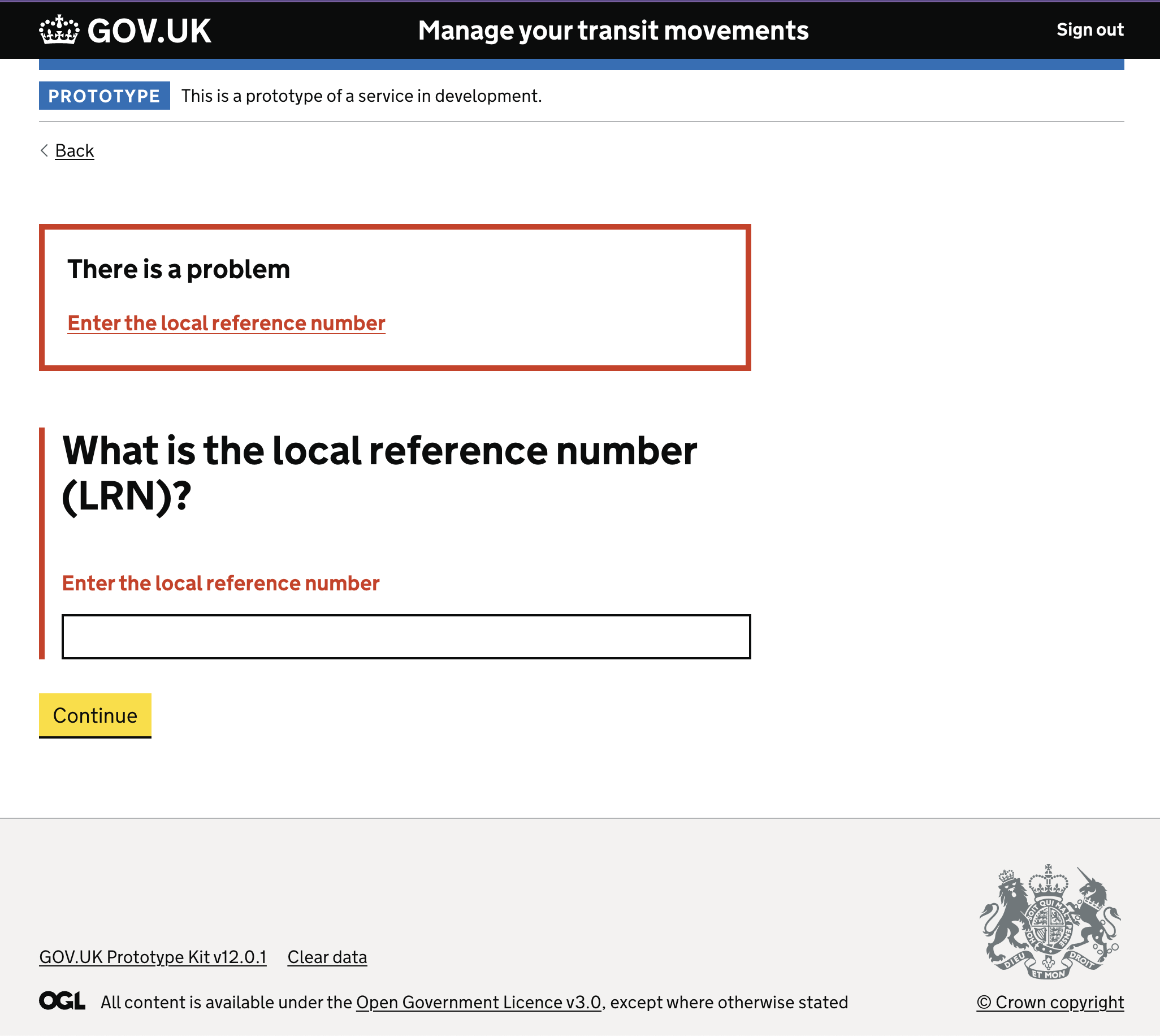
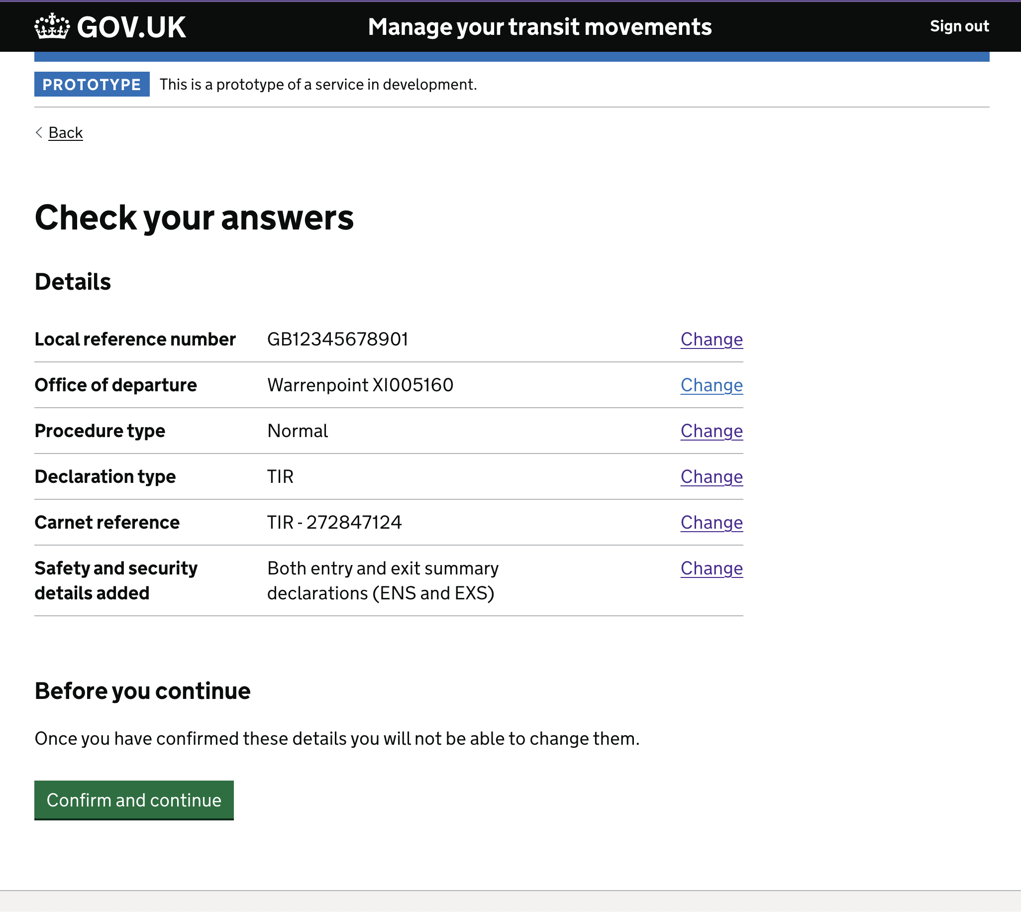
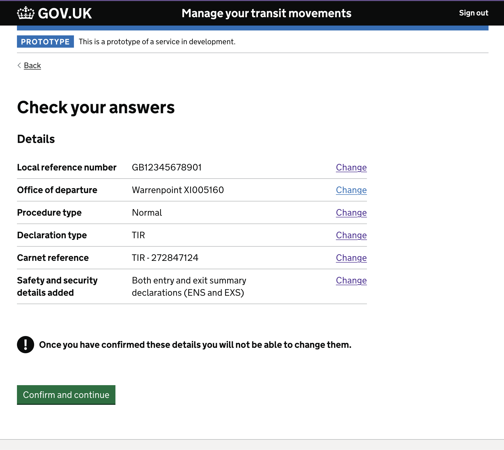
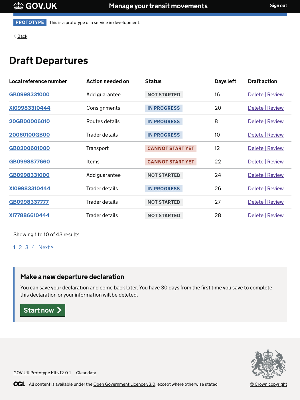
The LRN — Local Reference Number — is the anchor for the entire declaration. We handled the error state carefully: clear indication of what went wrong, direct link back to the field, no loss of prior input.
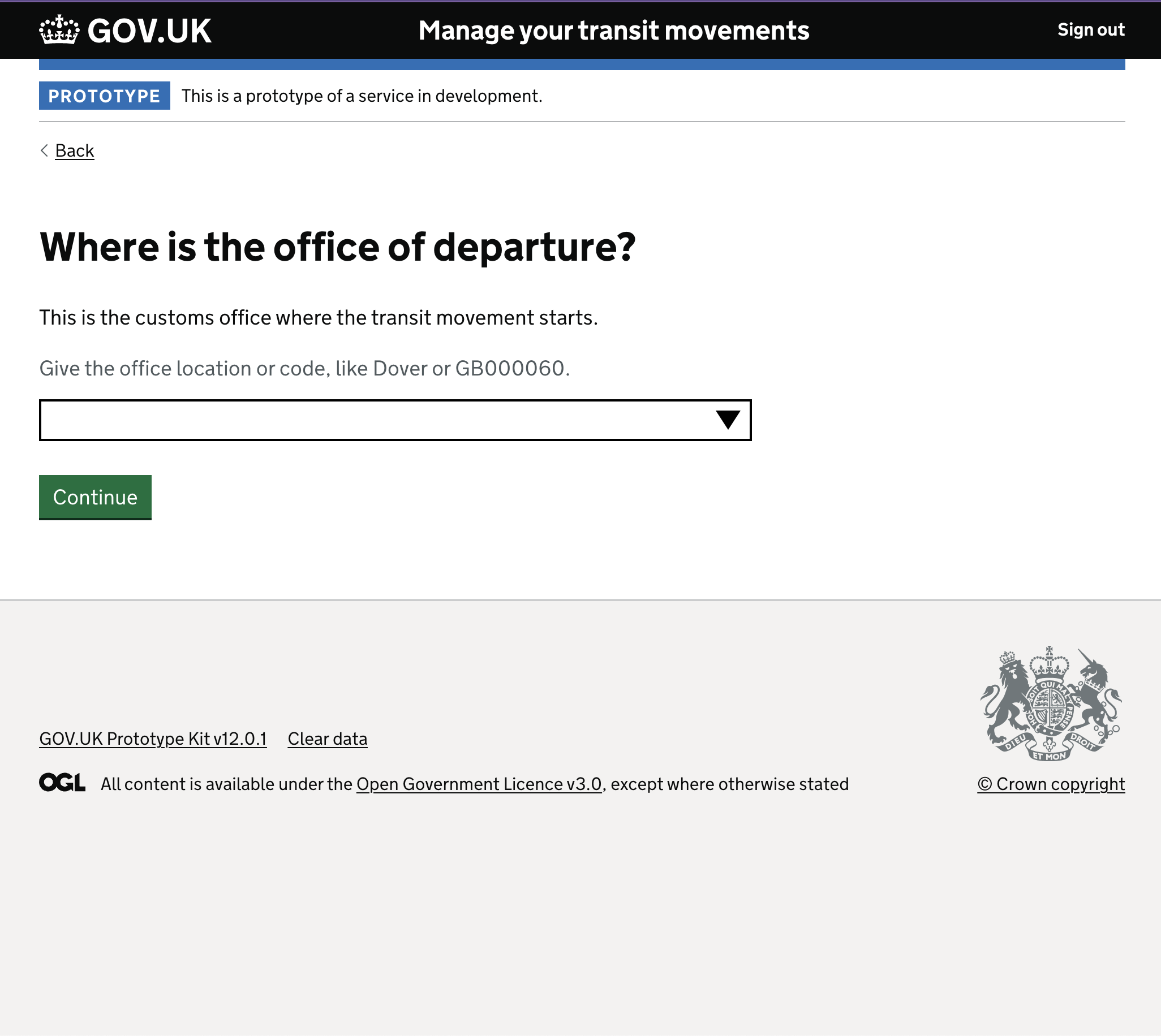
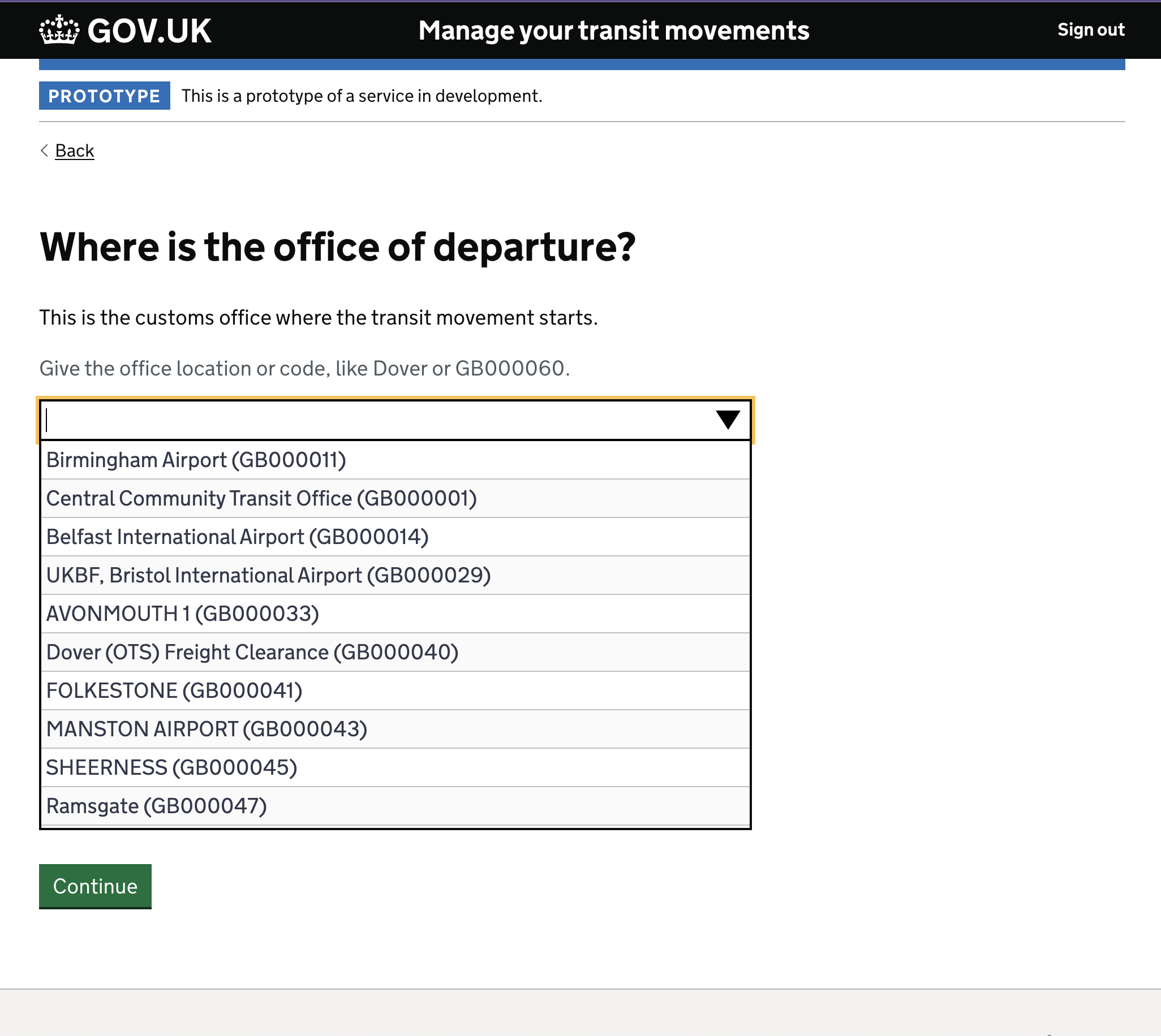
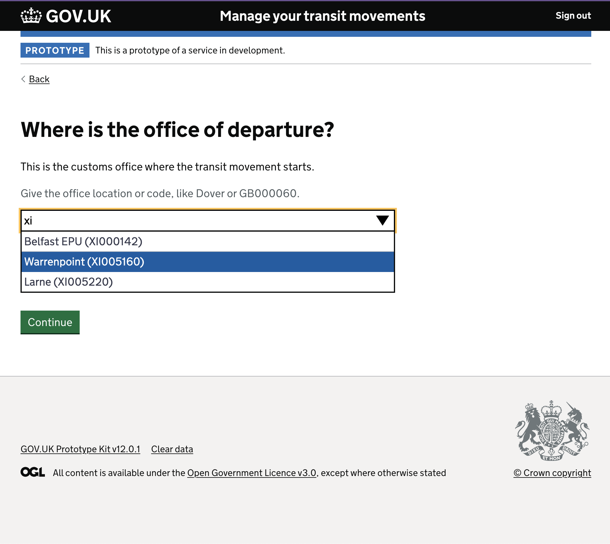
The office of departure journey required conditional logic based on the user’s location and route. Three sequential screens resolved what a less considered design would have collapsed into a single confusing question.
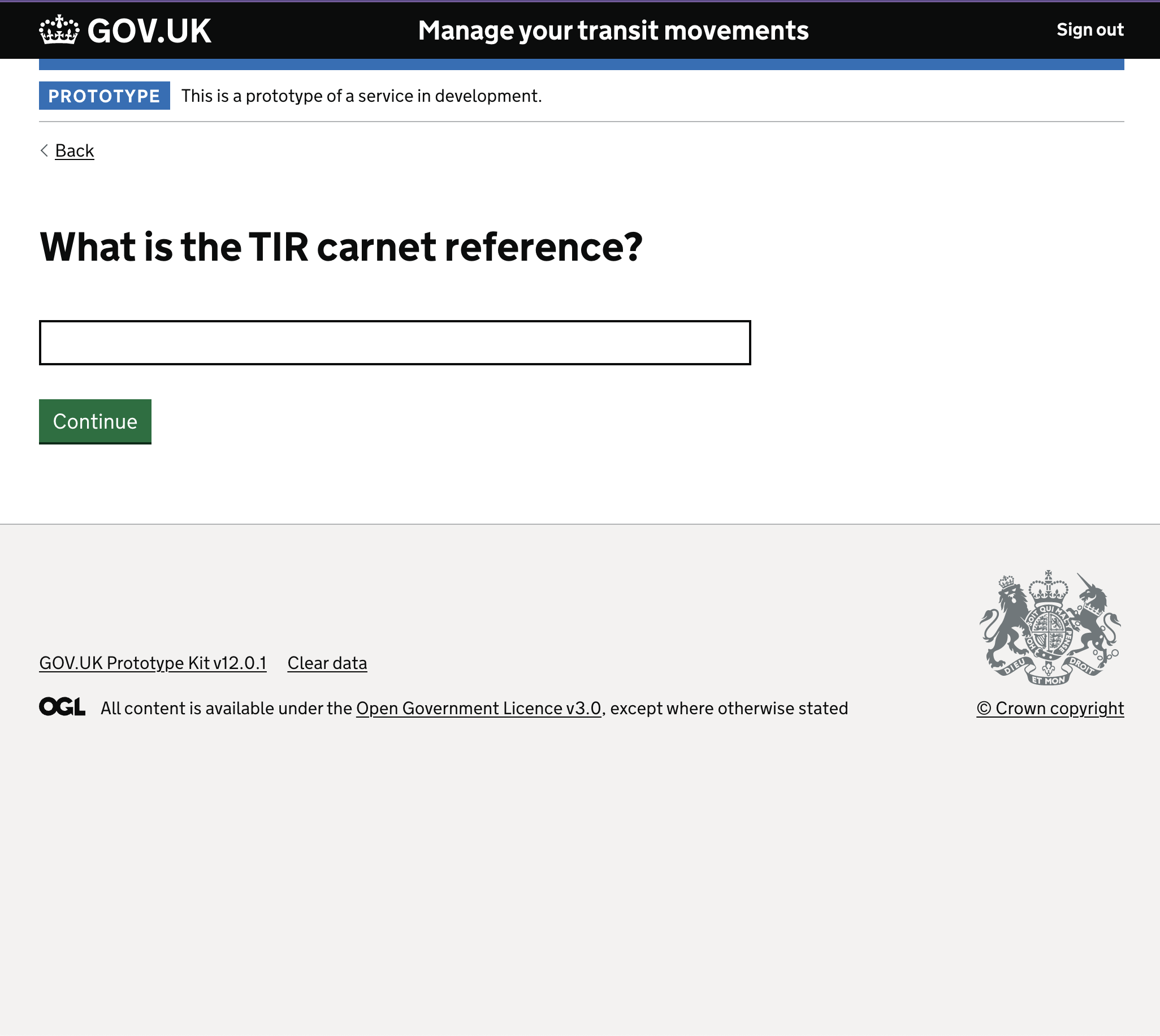
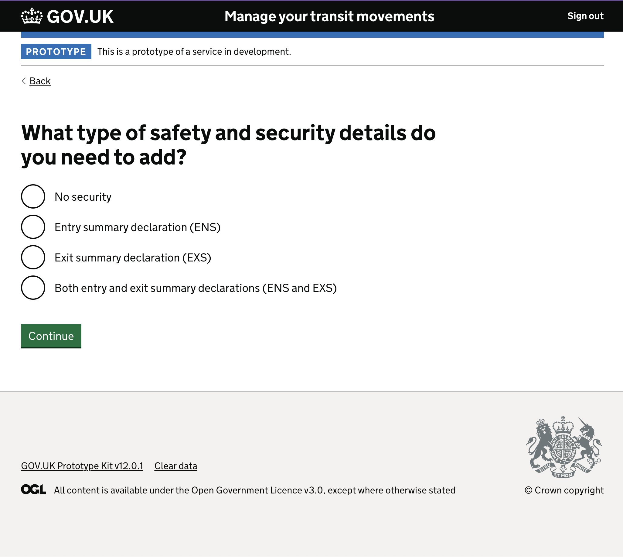
TIR Carnet and Security Details completed the pre-task list — each handled as an isolated, single-purpose question.
The iteration that got to 100%
Midway through the programme, we encountered a specific problem that illustrates exactly how this kind of design work goes.
At the start of the declaration journey, after five to seven questions, the service reaches a point of no return. The user cannot amend previously confirmed information. This is a genuine constraint of the underlying system — not a design choice. The question was: how do you communicate that to a user who has just spent ten minutes providing data?
Round one: We added a paragraph beneath the relevant heading explaining the constraint. Clear, accurate, appropriately placed. Six out of six users in testing missed it entirely. Not one person noticed.
Round two: We escalated to warning text: bold, with a prominent icon, styled to stand out from the surrounding content. Five out of six users missed it. One noticed. One.
Round three: We replaced it with a full notification banner — the kind used for high-priority information — styled in an experimental blue that stood outside the normal palette. Six out of six users saw it. Task completion: 100%.
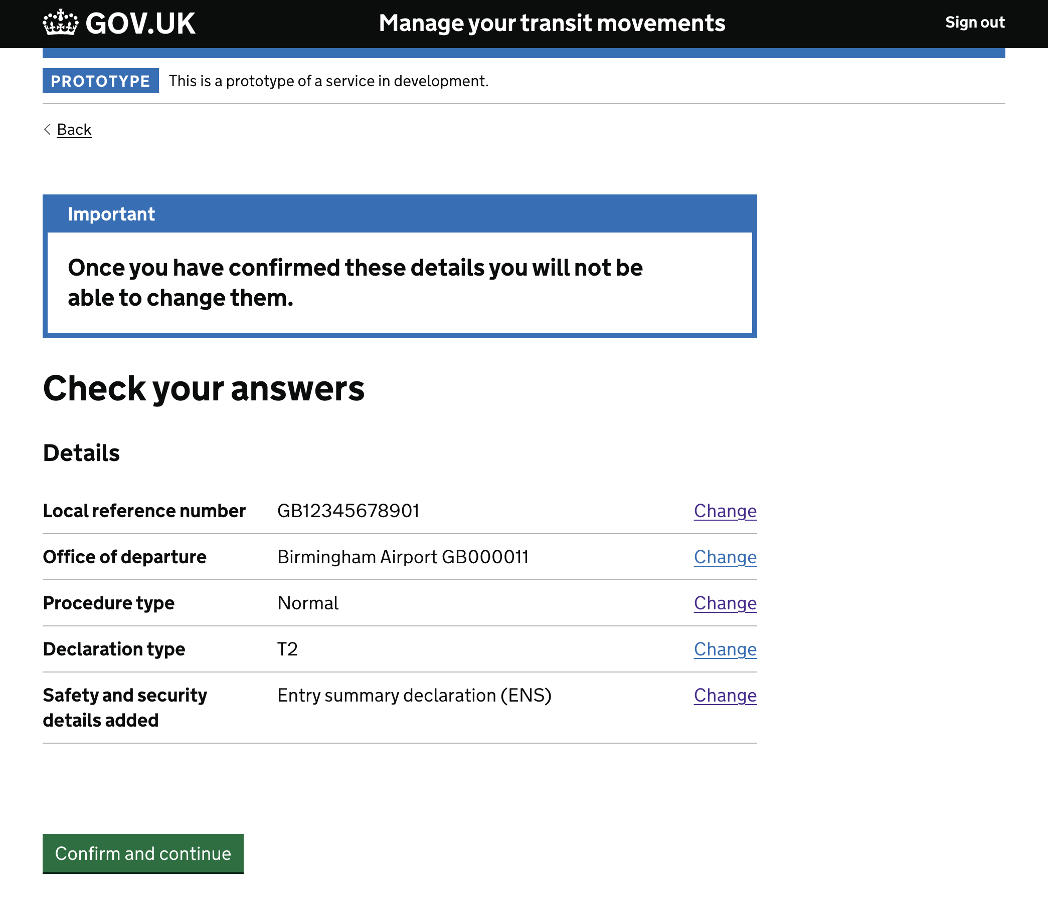
The lesson was precise: the design failed twice before it succeeded. Not because the information was wrong, but because the visual weight wasn’t earning the attention the content needed. Focusing on the macro interaction — the gestalt of the page rather than an individual element — gave us the solution.
Trader details: progressive disclosure across a complex journey
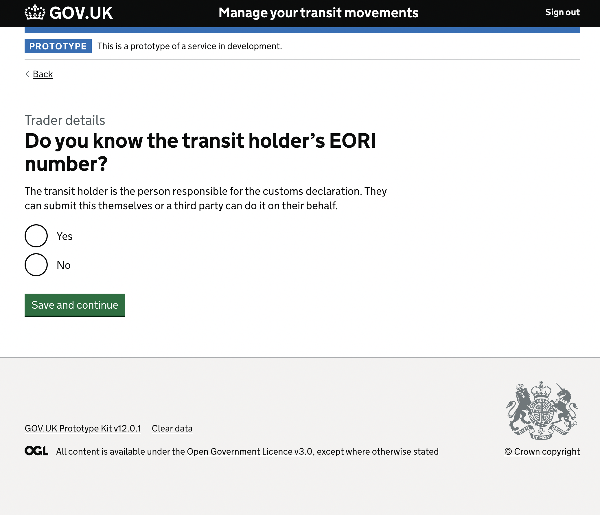
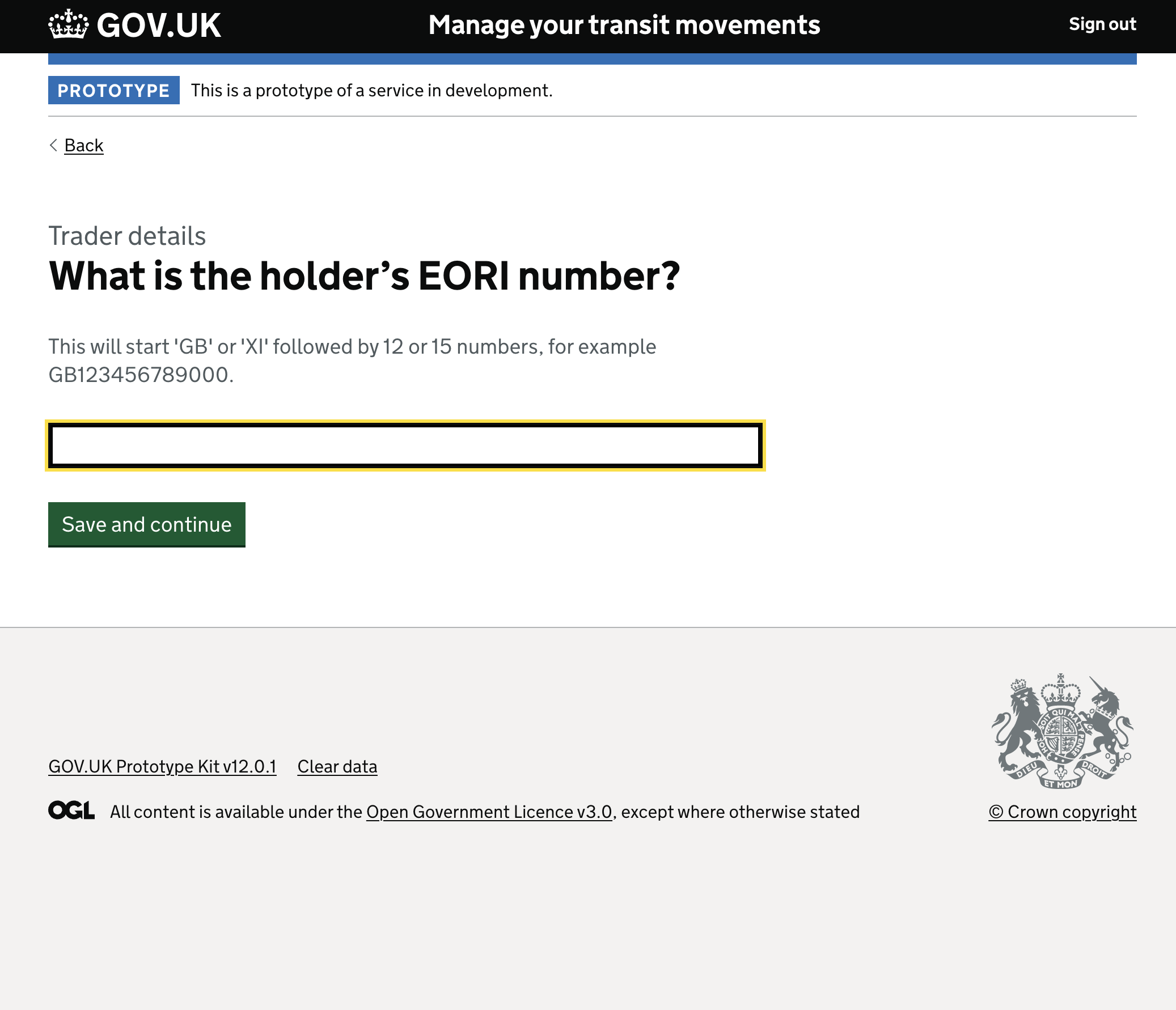
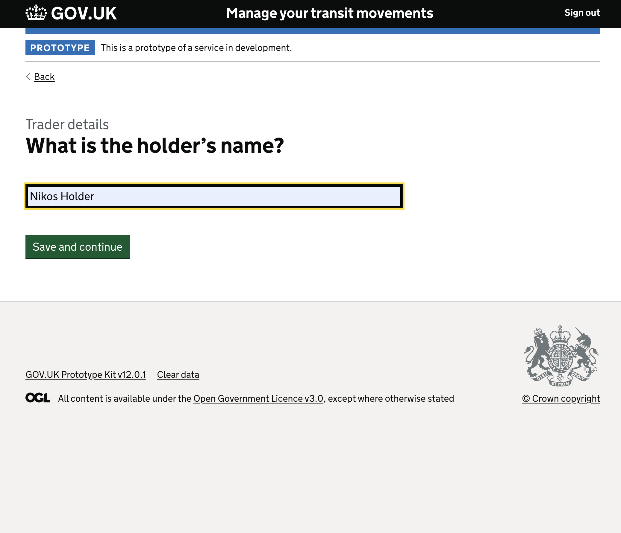
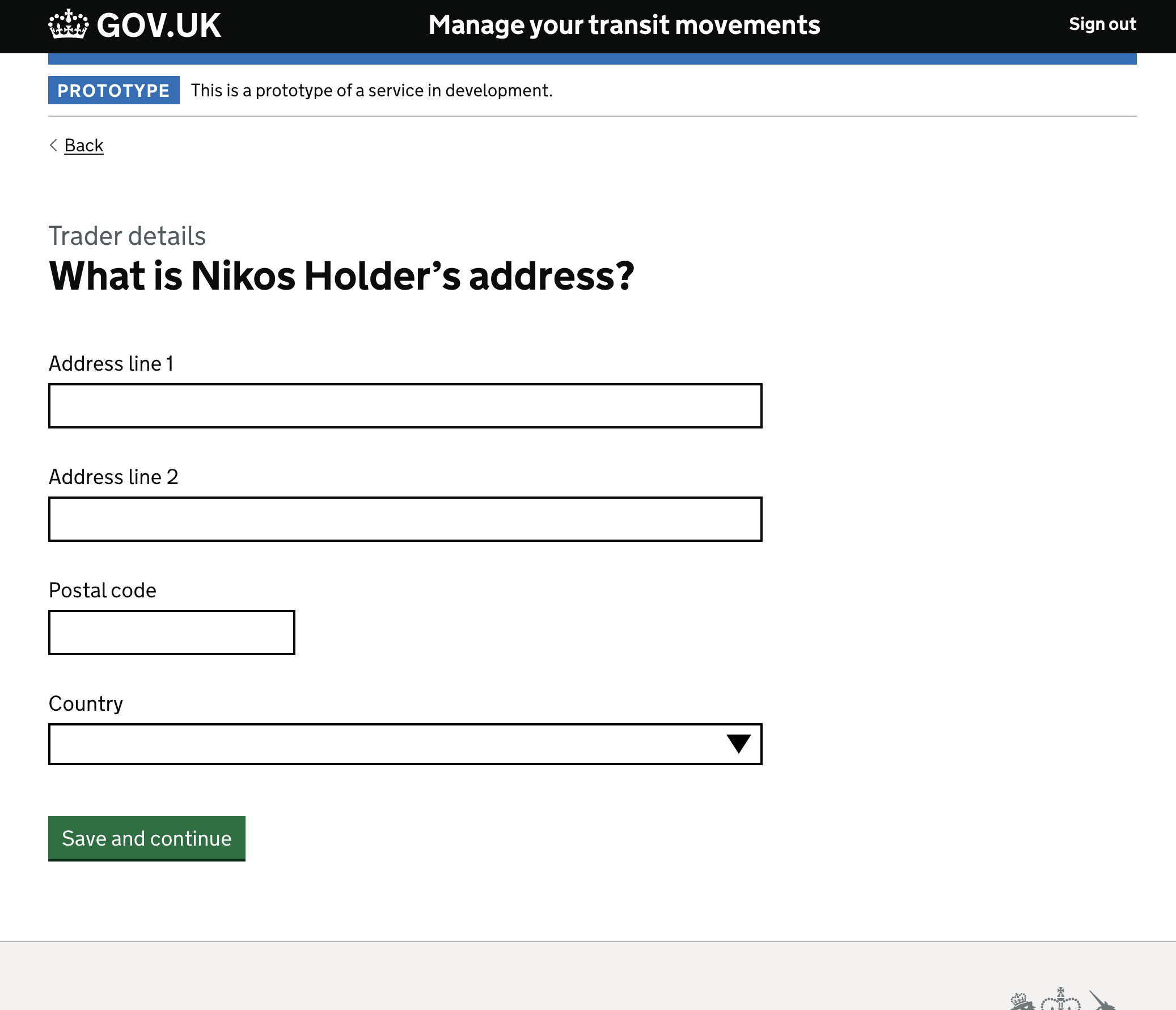
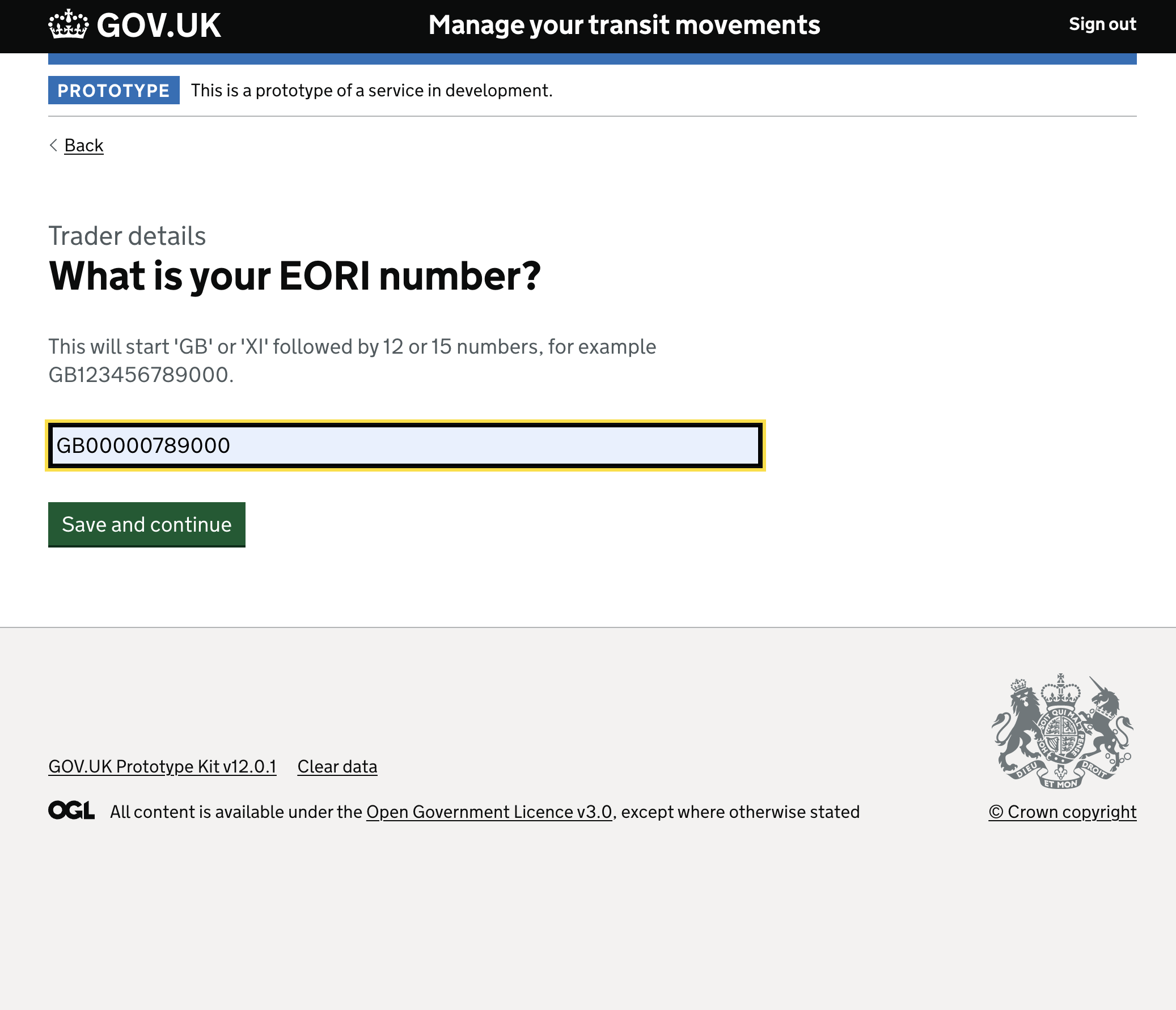
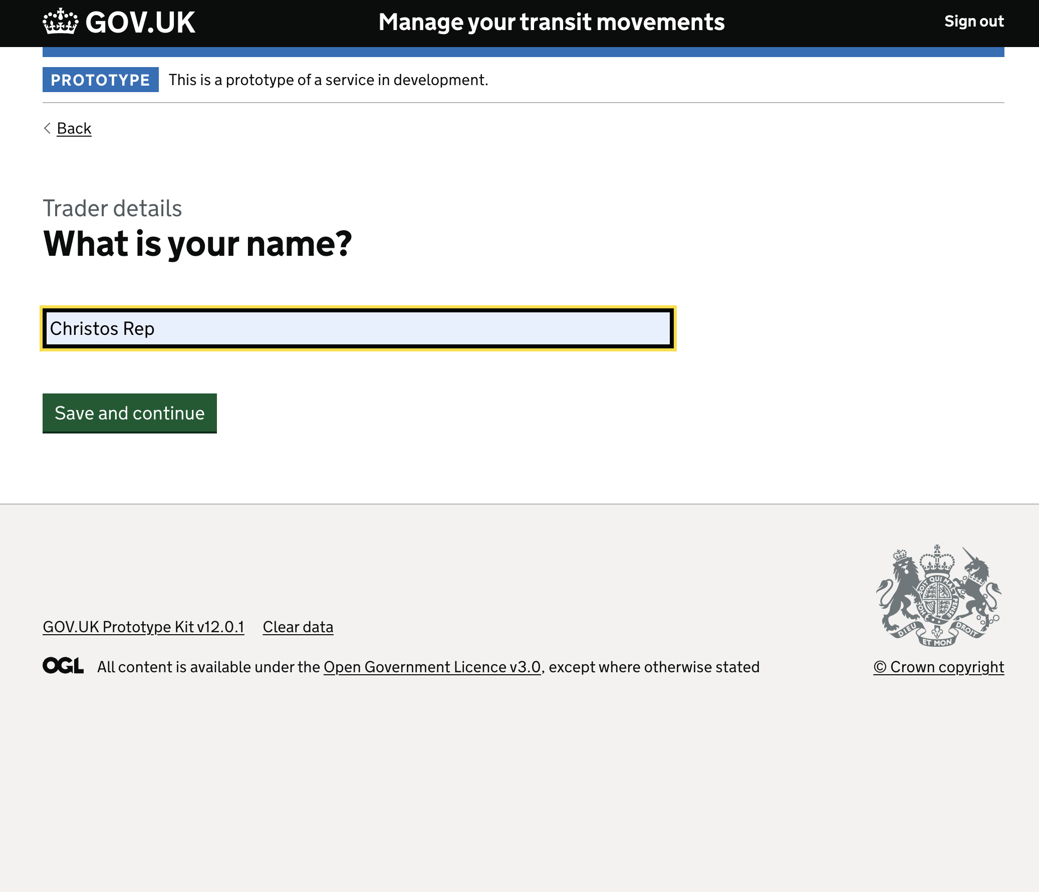
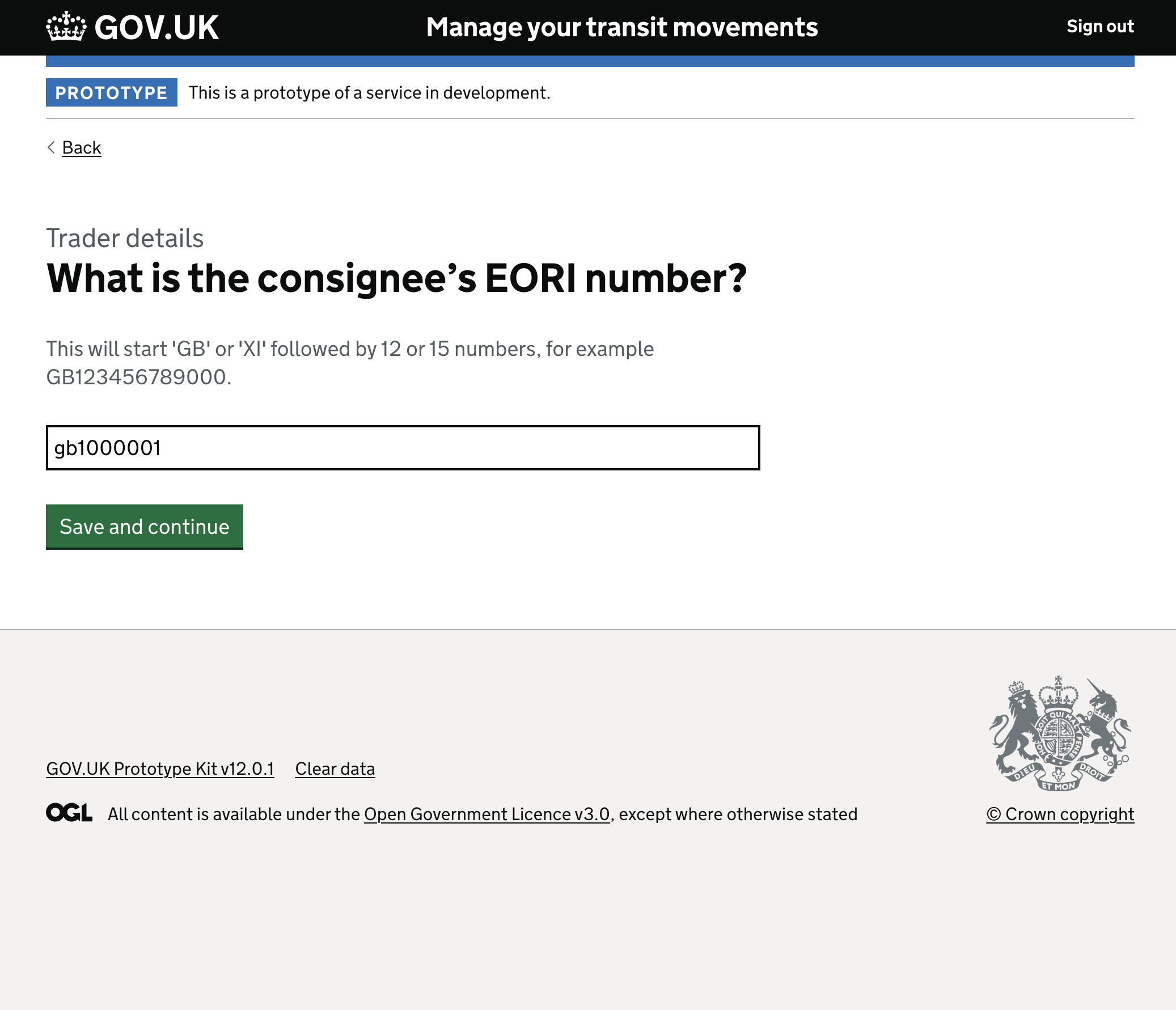
The Trader Details section is where the system’s dependency complexity hits users hardest. Within the broader system, capturing this data requires navigating a web of dependencies: whether a user knows their EORI number, whether they are representing themselves or acting as an indirect representative, and what specific legal capacities they hold.
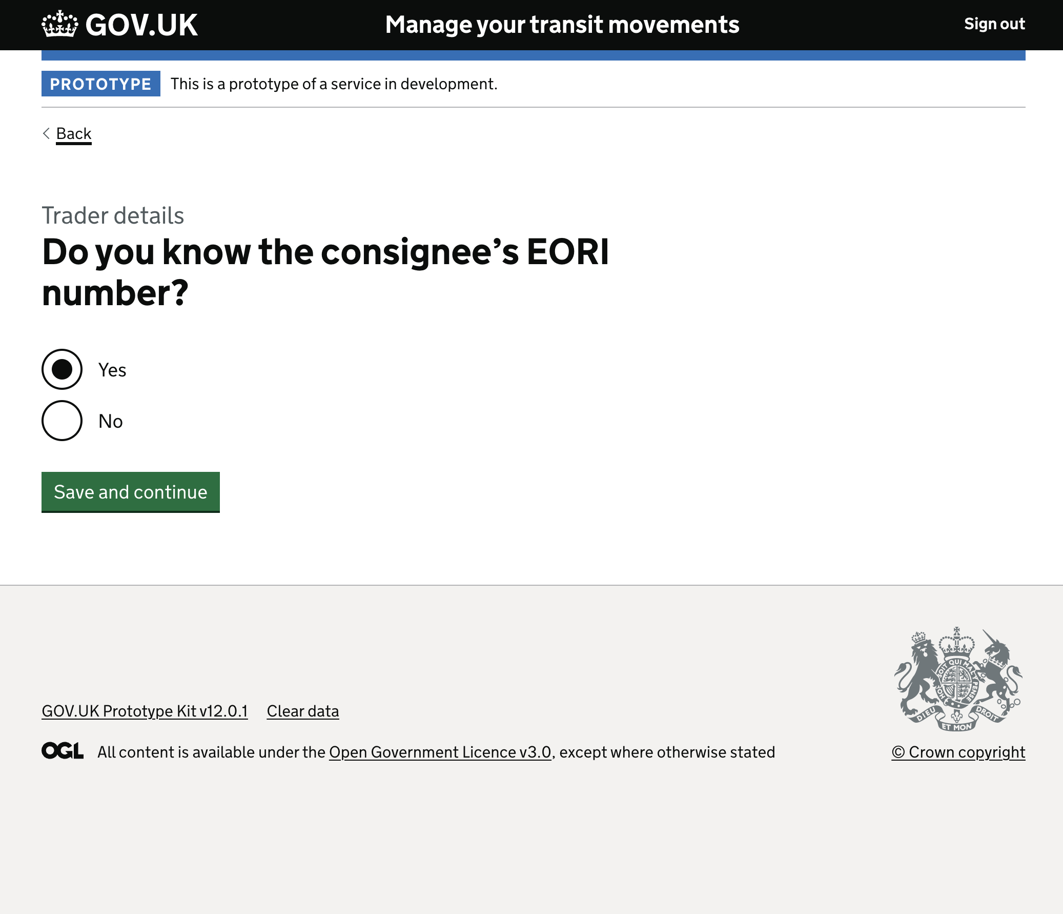
The design principle: progressive disclosure. Instead of demanding an alphanumeric code upfront, the flow begins by establishing knowledge. “Do you know the transit holder’s EORI number?” Only if they answer yes are they asked to provide it. This prevents errors and unnecessary friction for users who might not have that information immediately at hand.
Managing error states with absolute clarity. When a user encounters a problem, the interface provides immediate, clear guidance. The error summary box prominently lists “There is a problem” and links directly to the missed interaction, ensuring users can recover quickly without losing their place or their confidence.
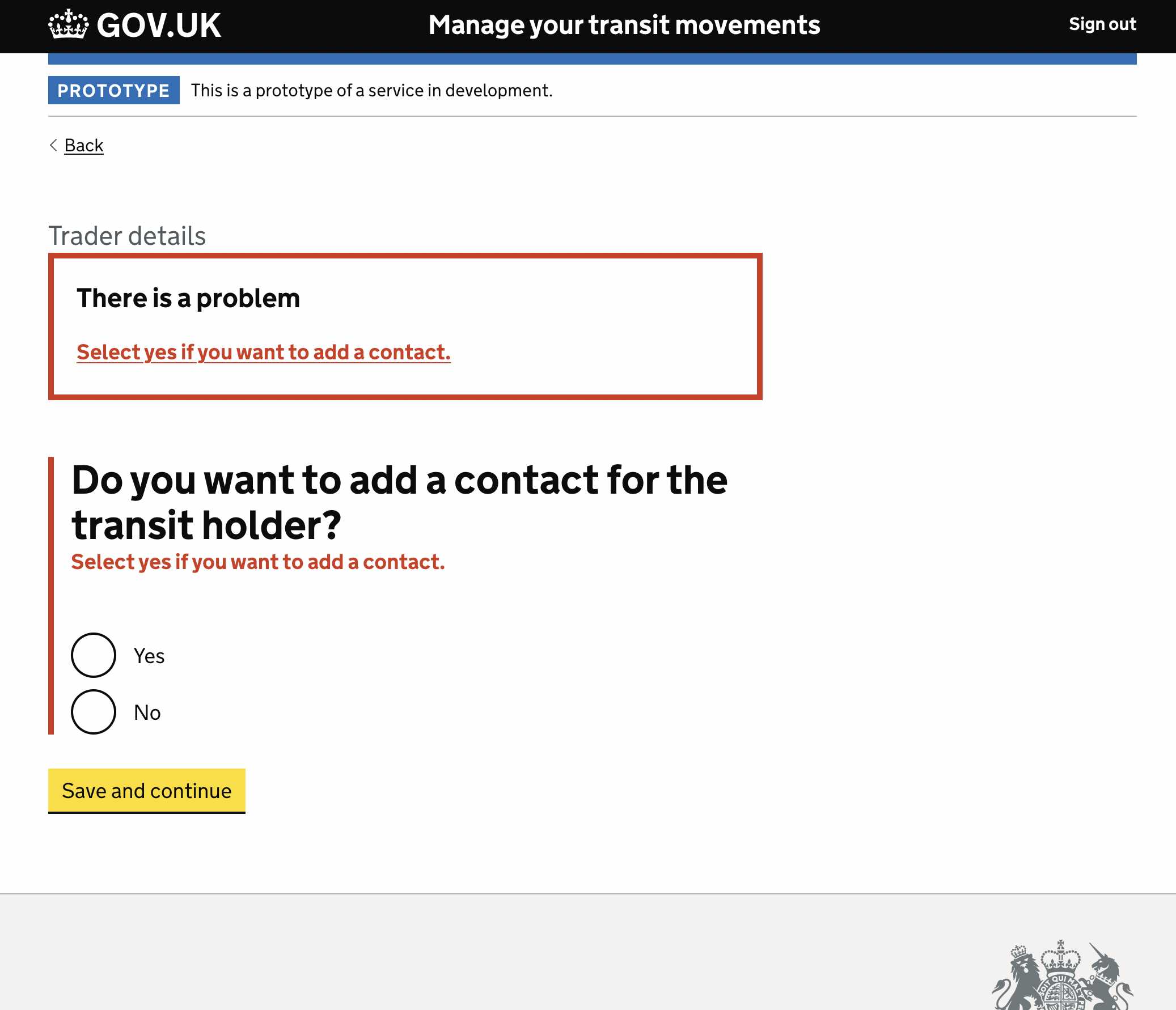
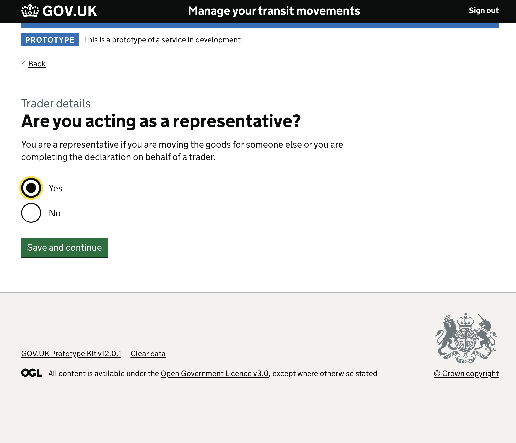
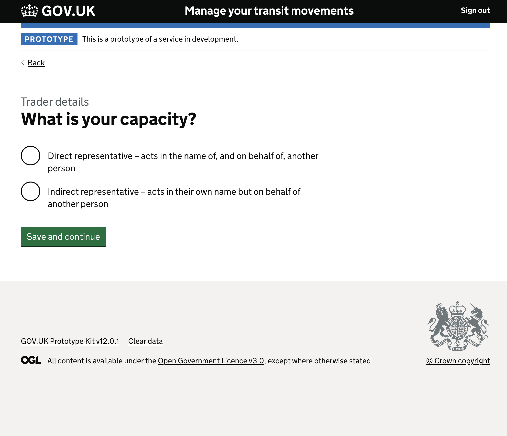
Defining legal capacity and representation. Traders often act on behalf of others. The interface seamlessly forks the journey by asking “Are you acting as a representative?” followed by a clear choice between direct representative (acting in the name of another) and indirect representative (acting in their own name but on behalf of another).
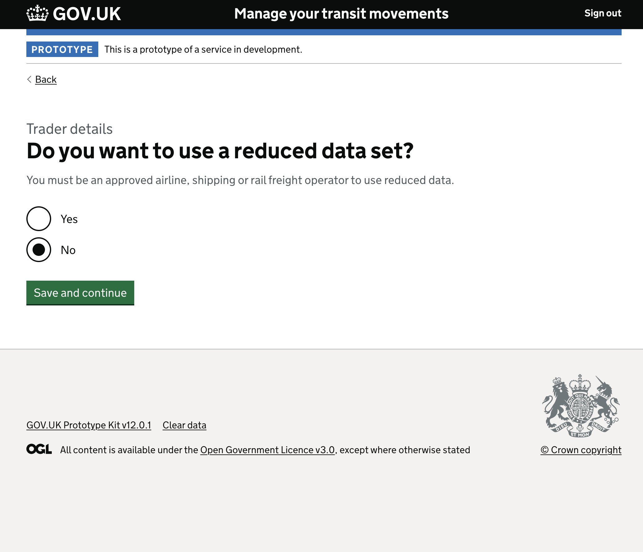
Adapting for approved operators. The logic accounts for users with special statuses: approved airline, shipping, or rail freight operators. By asking “Do you want to use a reduced data set?”, the system actively looks for opportunities to shorten the declaration process for trusted entities.
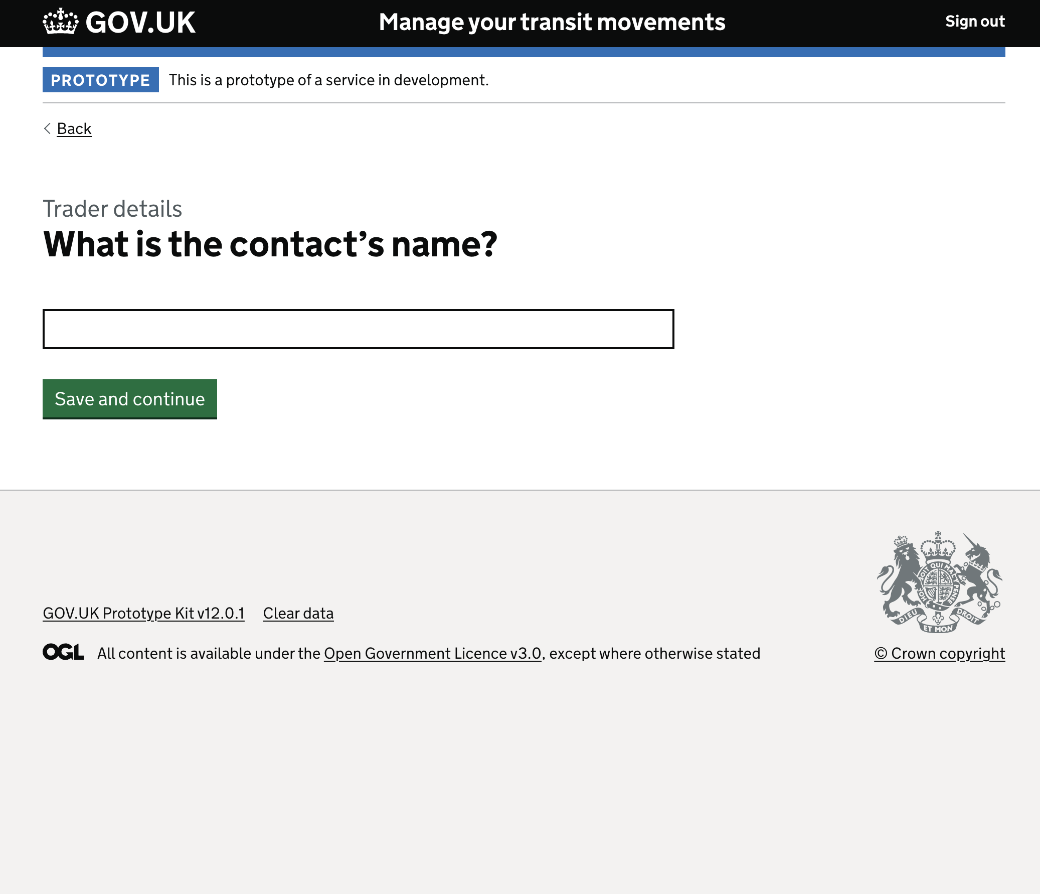
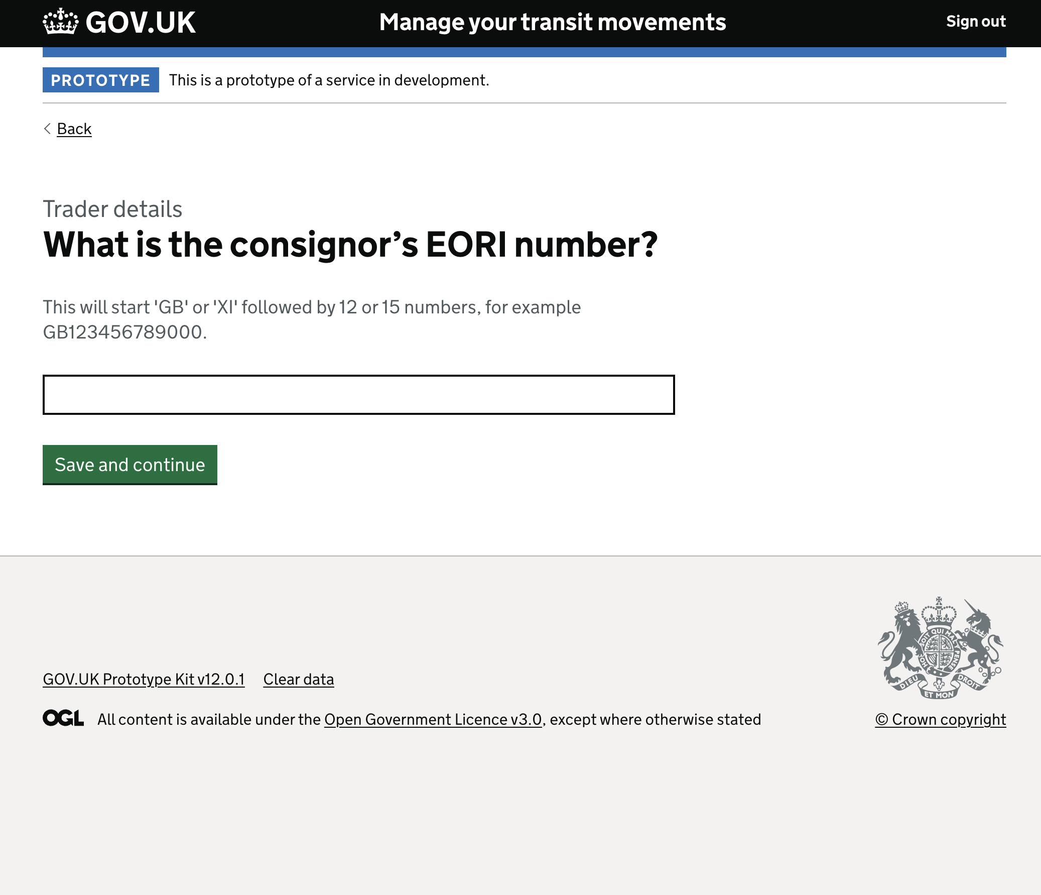
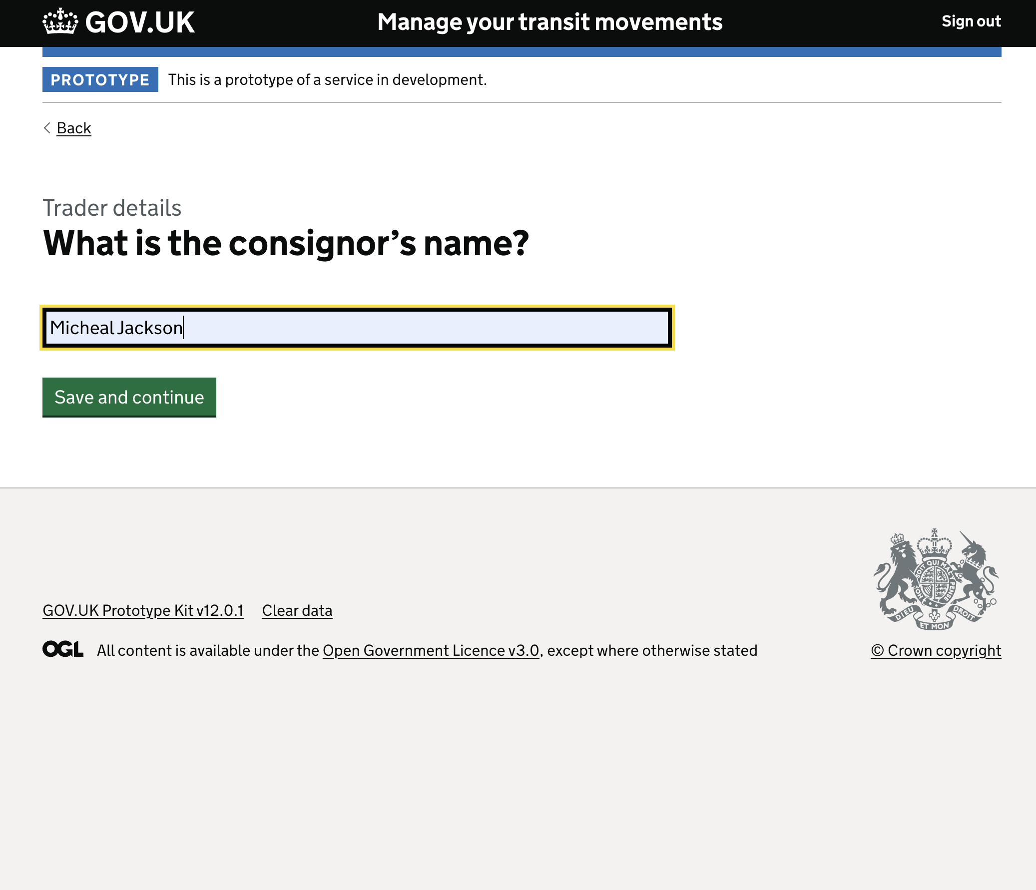
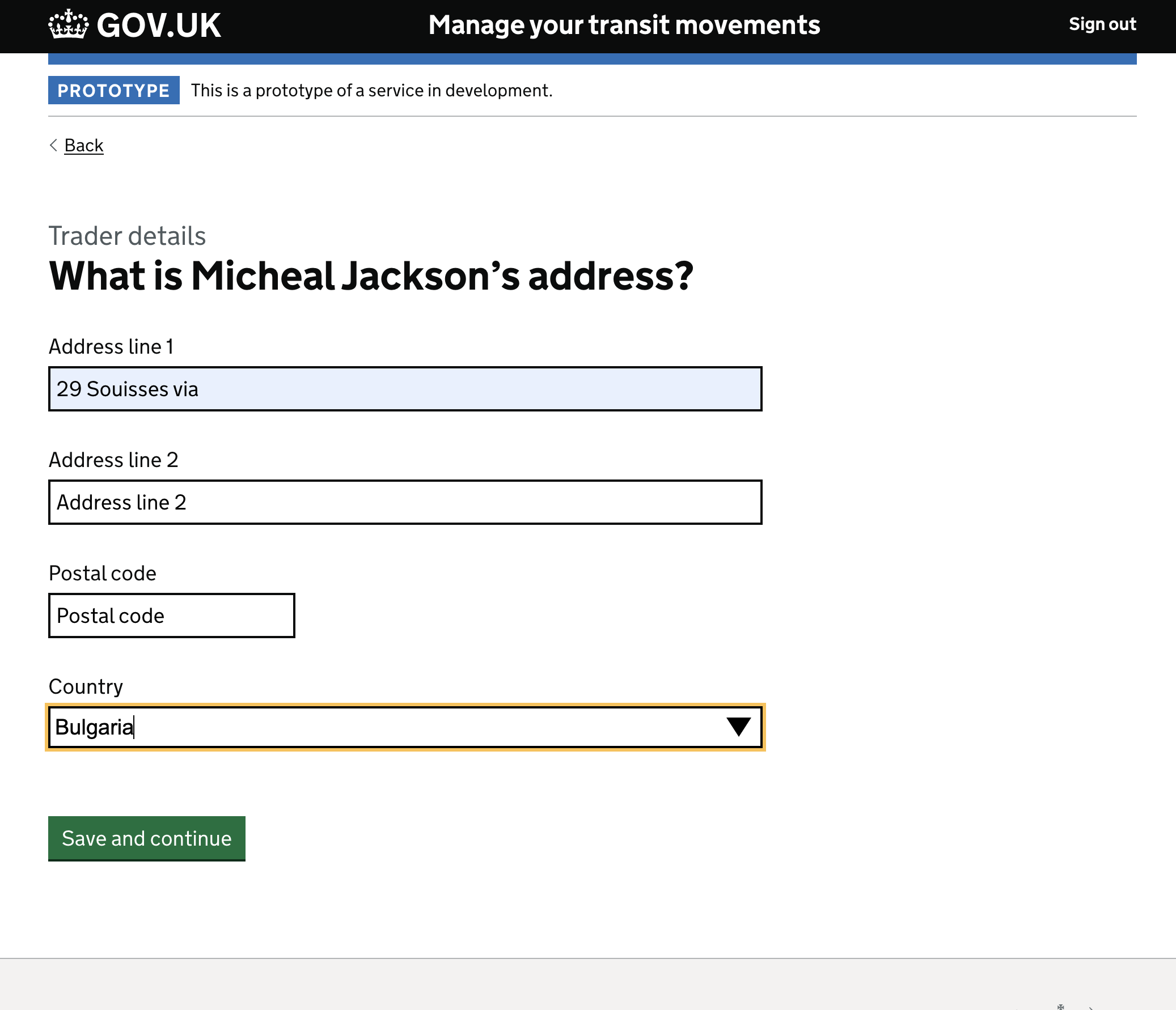
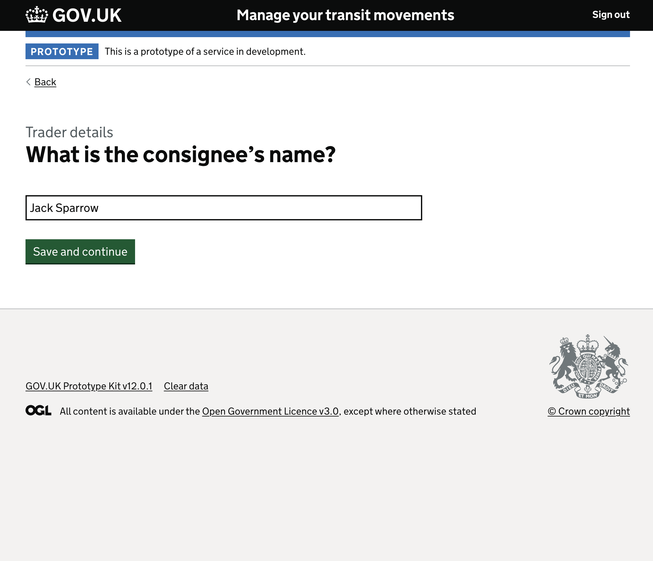
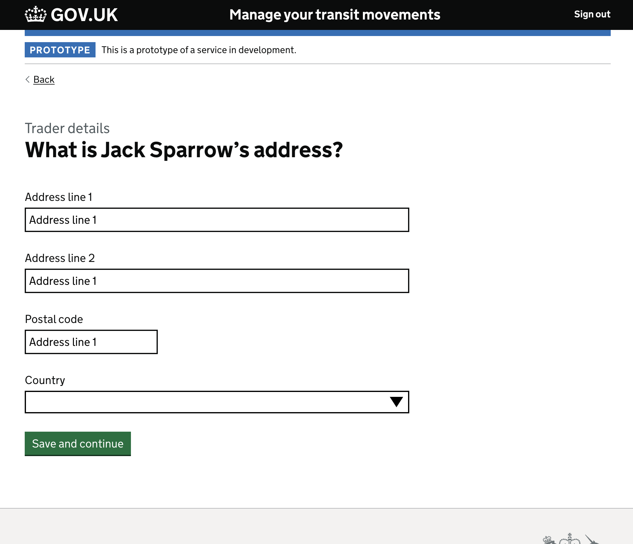
Consistent patterns for Consignor and Consignee data. As the journey moves to capturing Consignor details, the familiar progressive disclosure pattern repeats. The user is asked if they know the Consignor’s EORI, followed by their name and address. This consistency reduces cognitive load as the user moves deeper into the form.

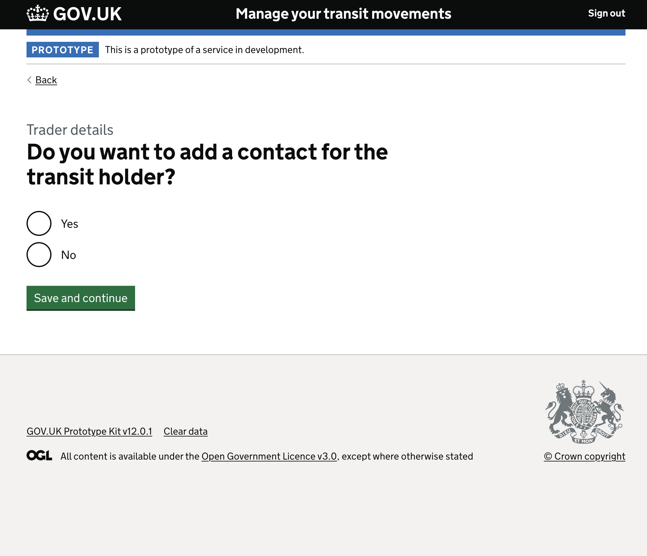
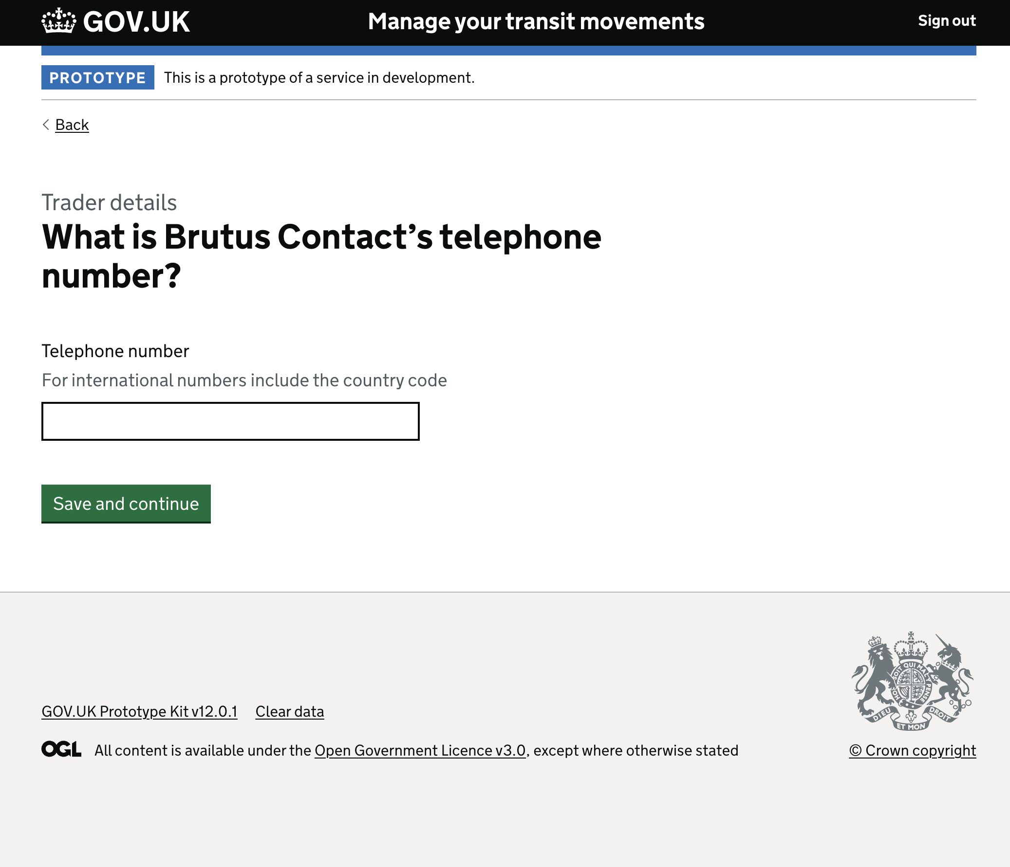
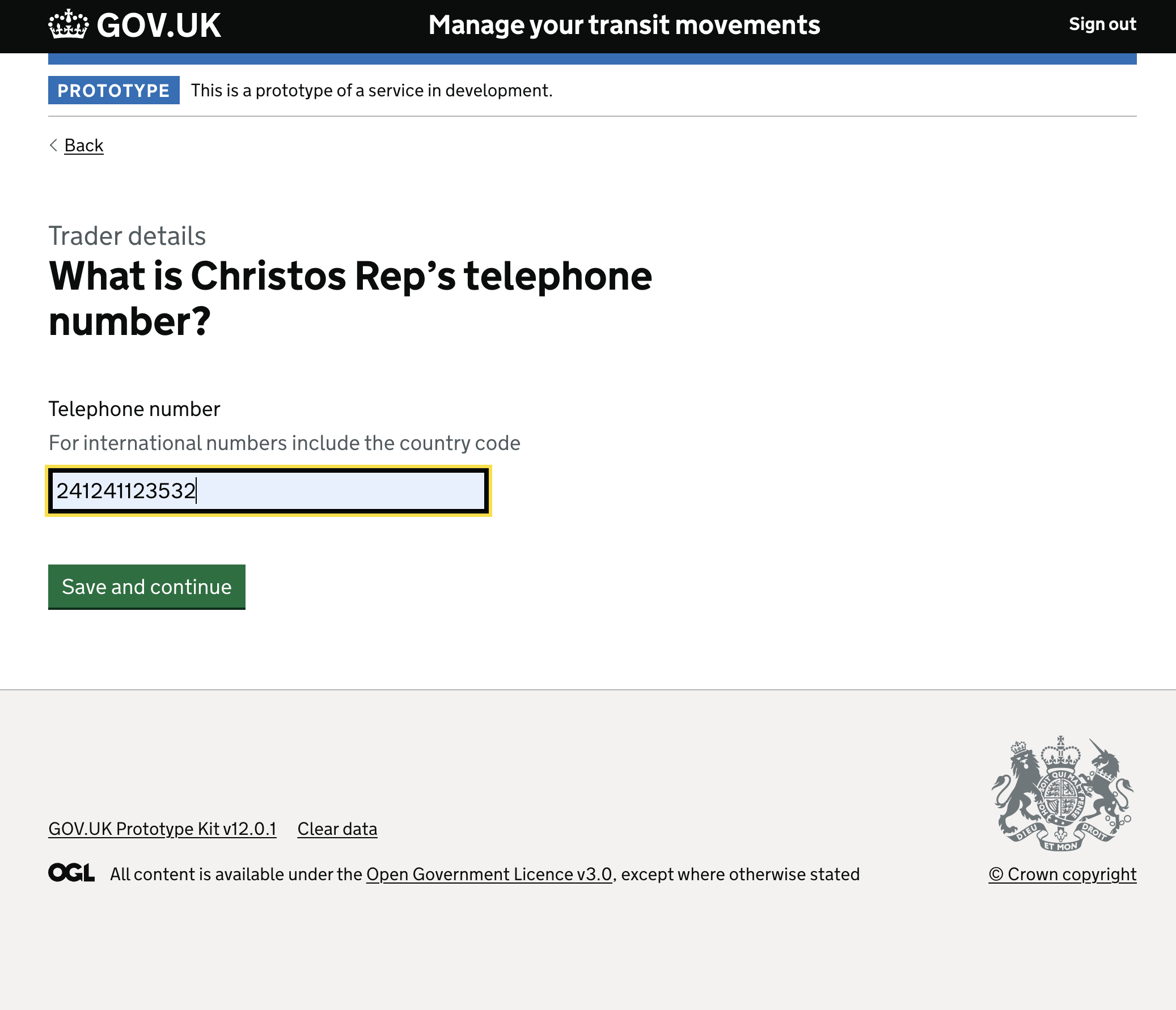
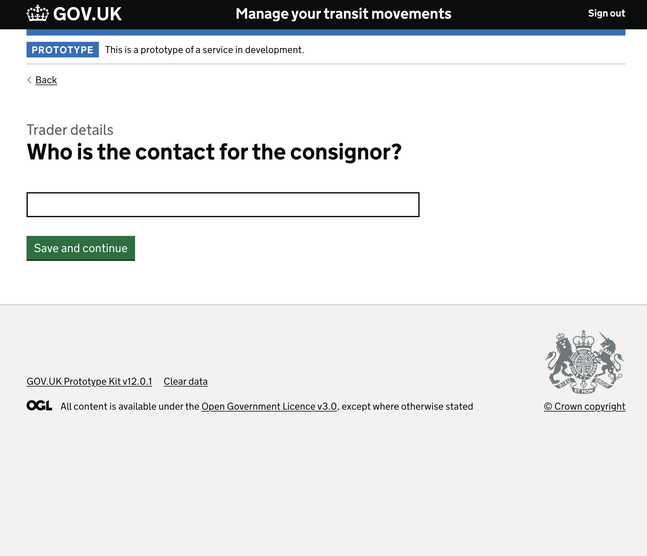
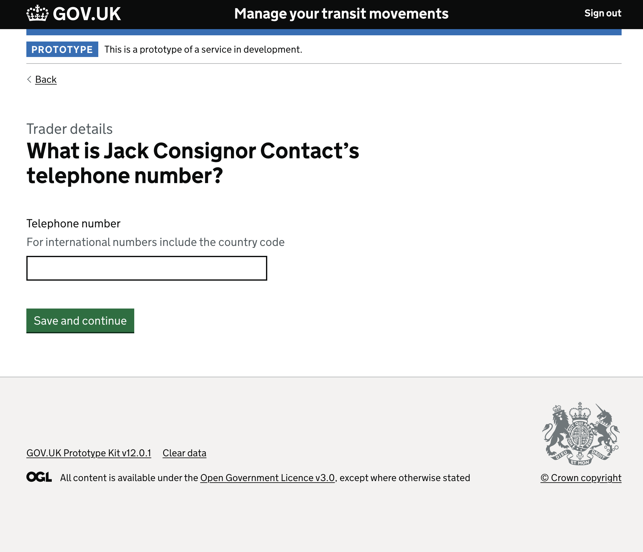
Branching choices for optional contact details. “Do you want to add a contact for the consignor?” creates a clean branch in the logic. If yes, the user is smoothly guided to input the contact’s name and international telephone number.

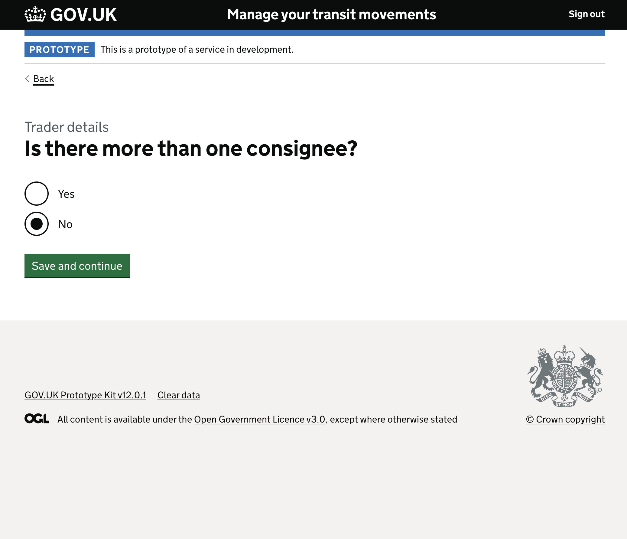
Managing looping logic for multiple consignees. Transit movements frequently involve multiple destinations or recipients. “Is there more than one consignee?” elegantly triggers a looping sequence in the background logic, allowing users to add as many entities as necessary without needing a complex grid or table interface.
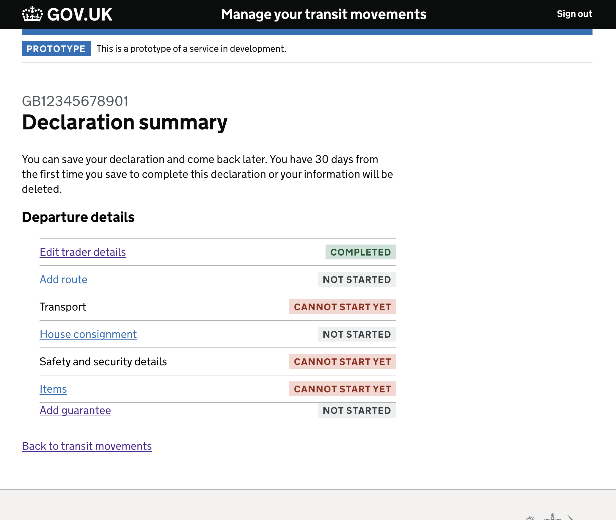
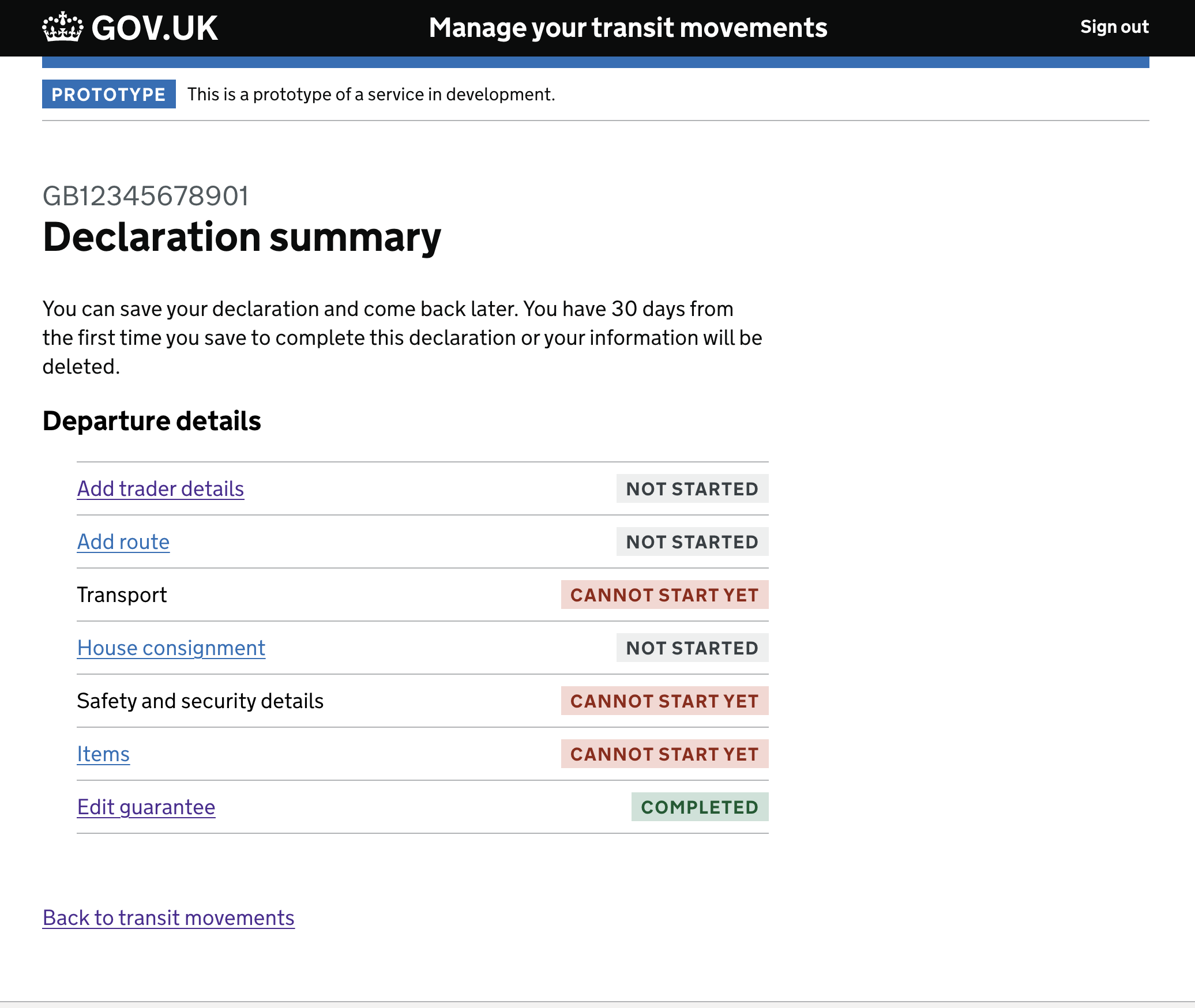
Providing cognitive relief at the end of the flow. The “Check your answers” screen gathers the fragmented, step-by-step inputs into a single comprehensive view. Here, the user can review their EORI, representative status, consignor, and consignee details with clear “Change” links — providing confidence before submission.
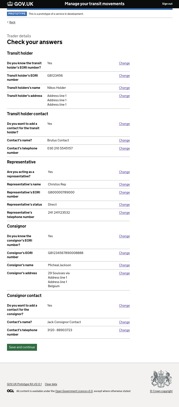
The final output transforms an overwhelming bureaucratic requirement into a clean, actionable task list. The Trader Details section is marked as a confident “COMPLETED”, while subsequent tasks like Route and Transport are clearly signposted — getting users ready for the everyday work of international trade.
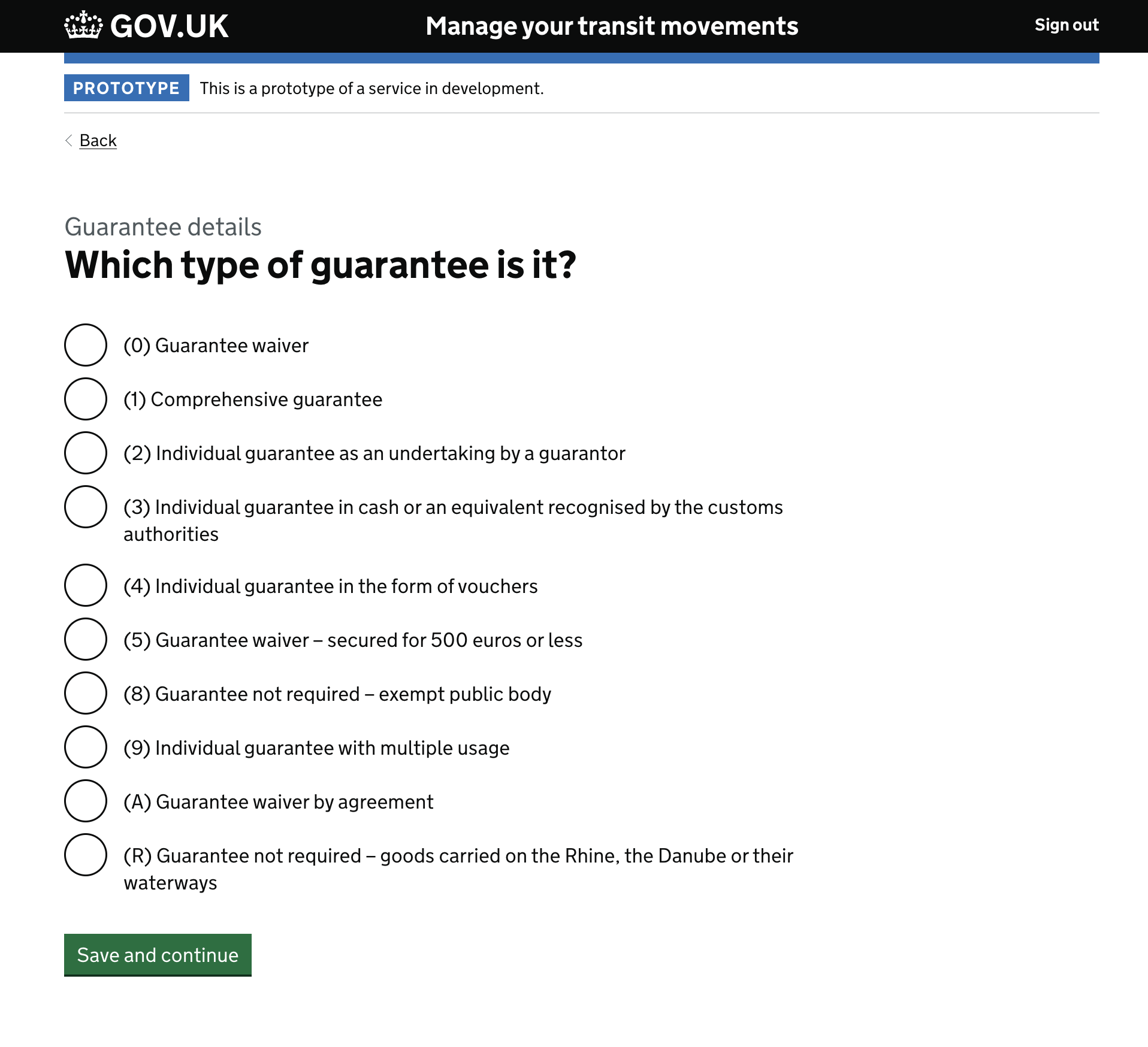
The Guarantee journey
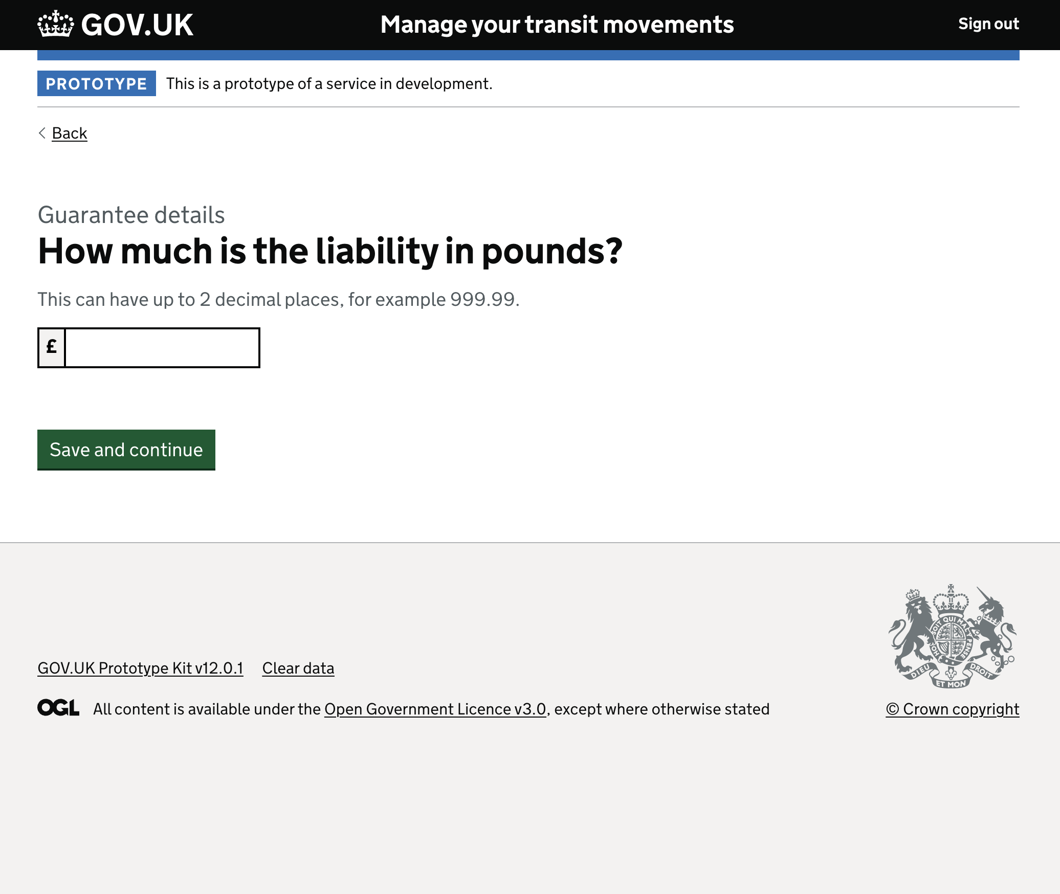
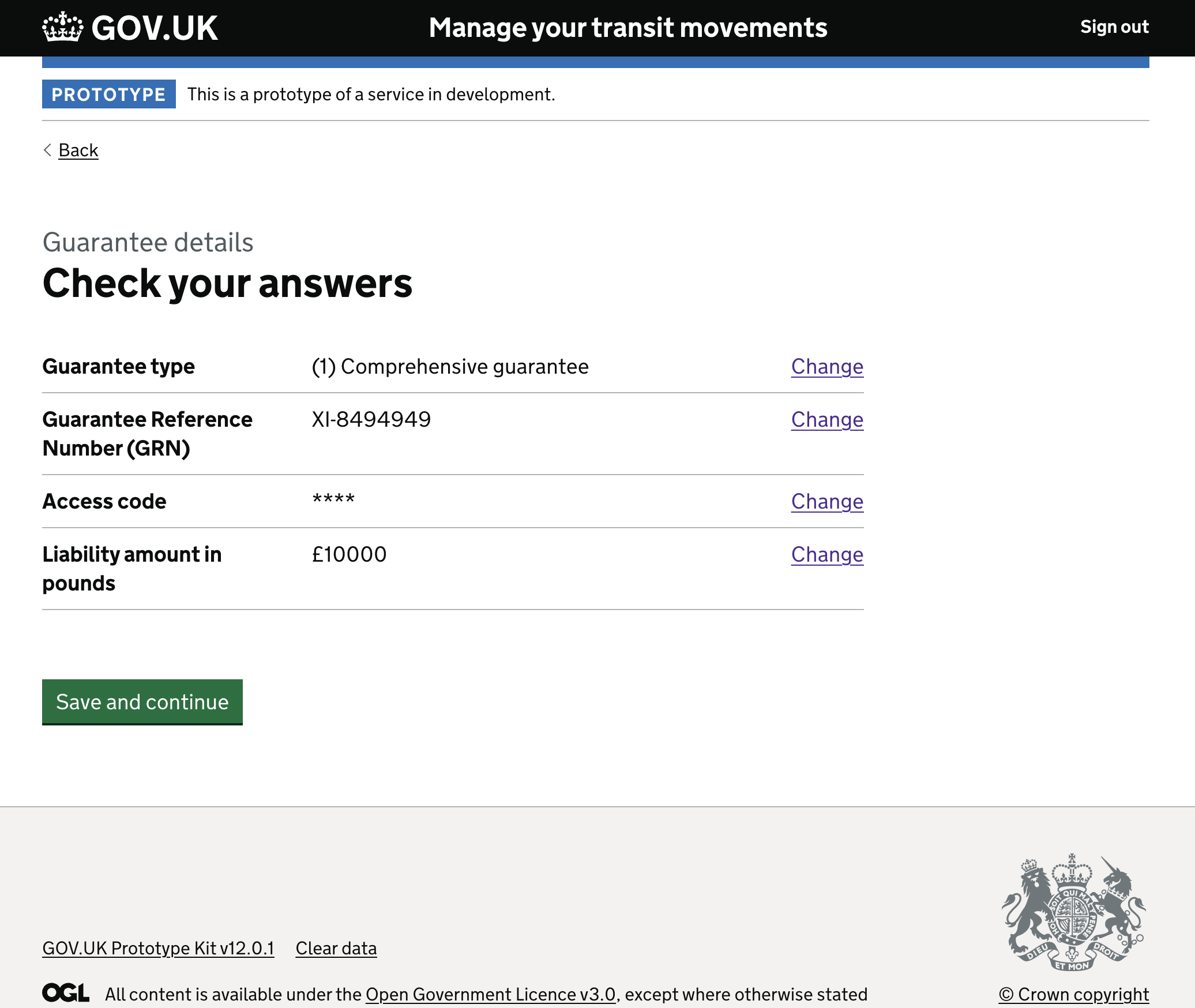
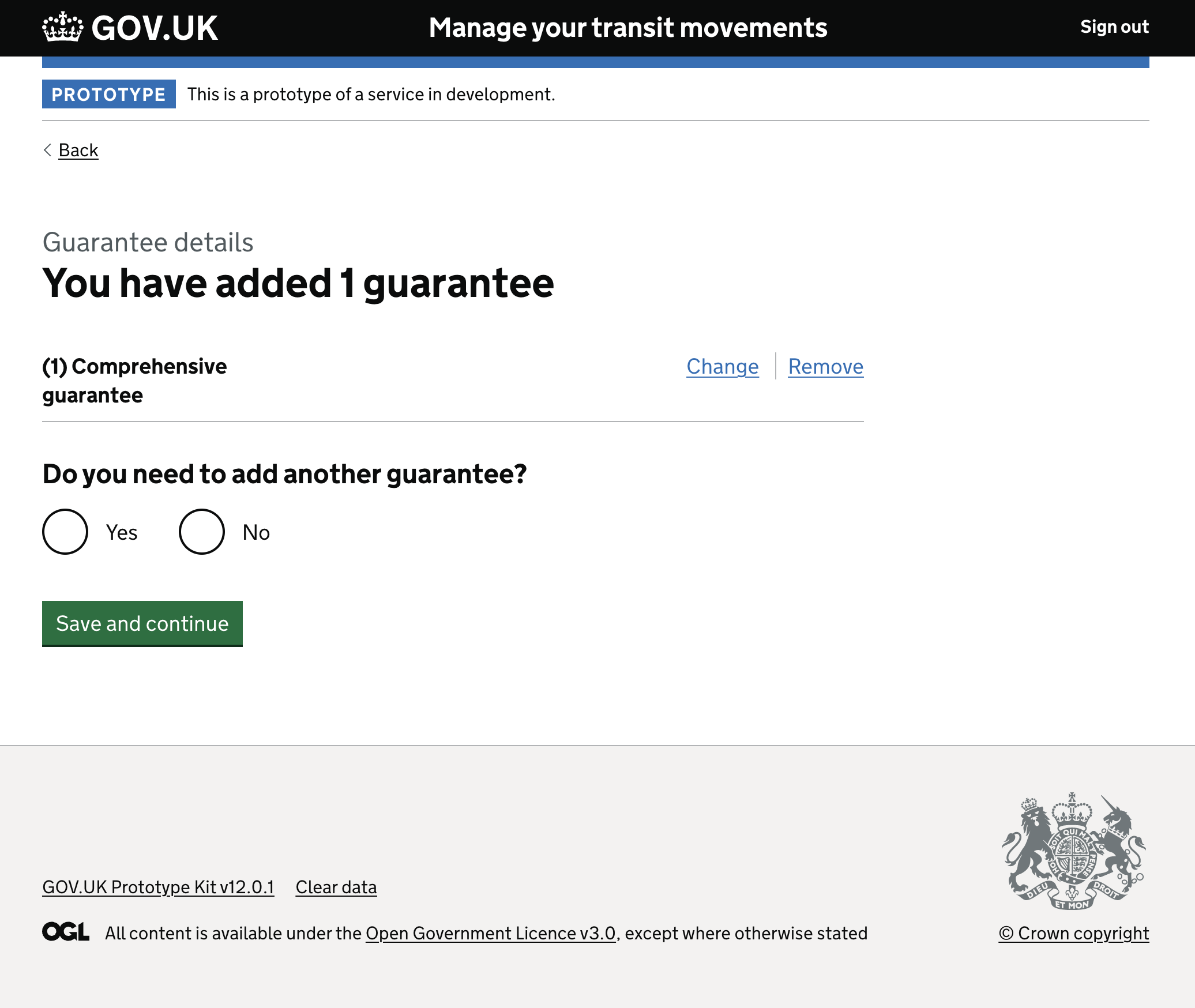
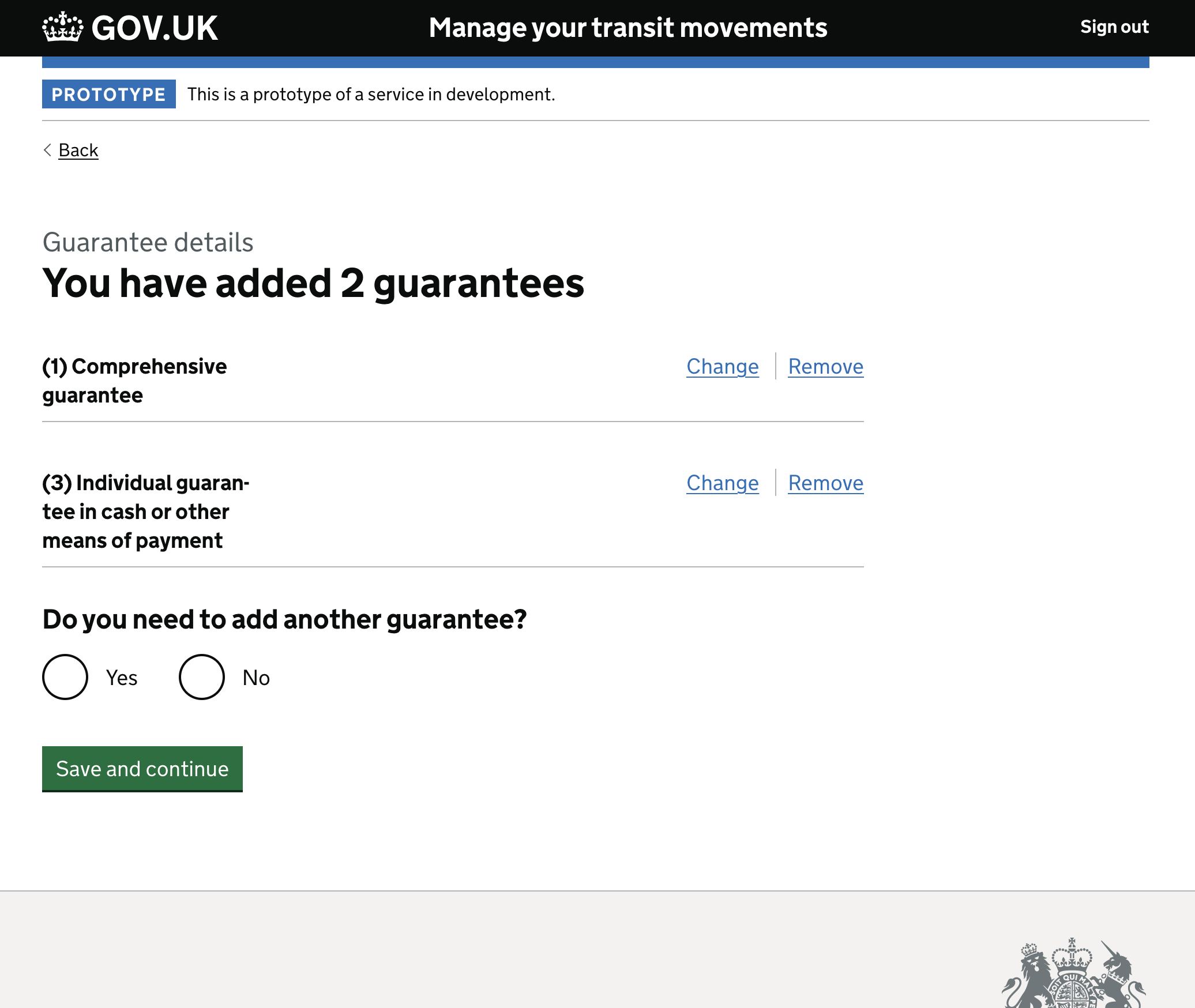
The guarantee section handled one of the more technically complex sub-problems: different guarantee types, each with their own validation paths and data requirements.
The routes sub-journey within the guarantee section was the final major challenge — and in some ways the most technically demanding prototype work of the project. Different combinations of route type, transport mode, and border crossing points created a decision tree with dozens of valid paths, each producing different subsequent screens.
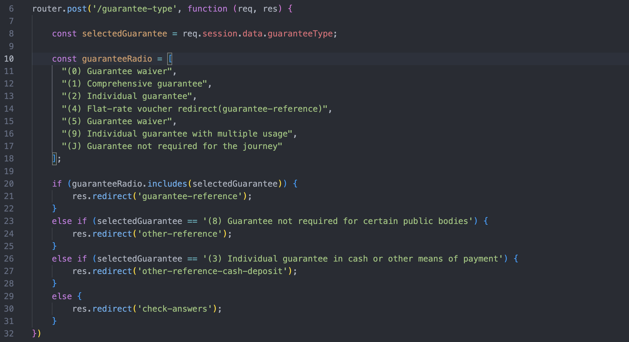
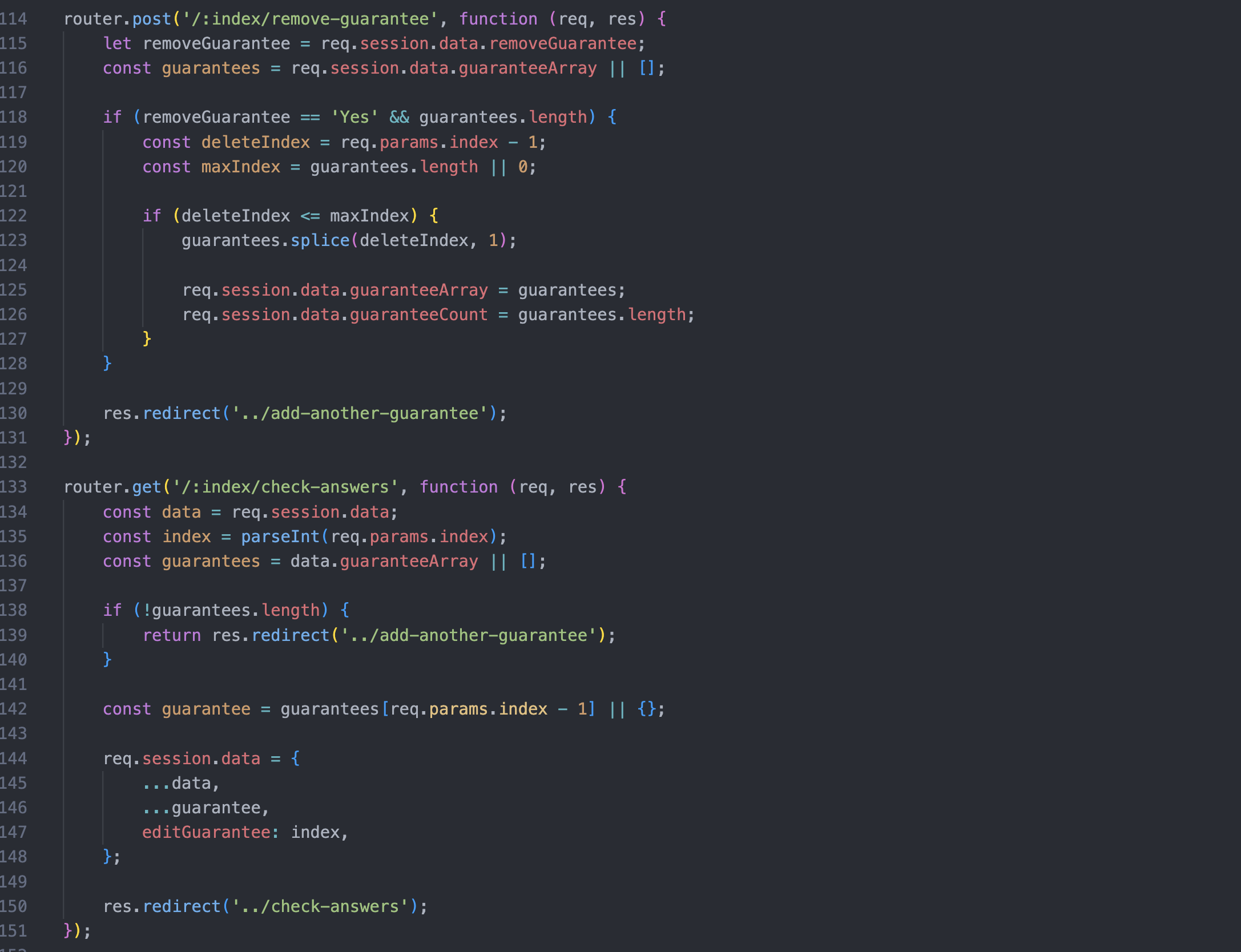
We modelled this dependency tree first, then built the prototype routing logic using conditional arrays and nested if/else statements in the route configuration. When the prototype was working accurately, we took it to research. When research confirmed it held up, we handed the logic over to the development team as a reference implementation.
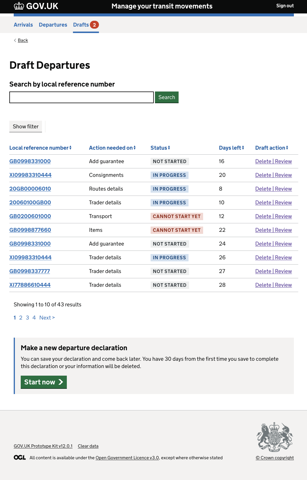
A/B testing the dashboard
For the save-and-retrieve functionality, we built multiple dashboard variants and created a dedicated research landing page to test them. Users navigated to whichever variant they were assigned. The results informed a design decision that would otherwise have been made on instinct.
Outcomes
100% task completion on the declaration journey. The most complex, dependency-heavy, multi-party journey in the service achieved a 100% task completion rate in user research.
Service map and dependency model adopted. Both became team-wide reference documents, consulted throughout the programme.
Validation framework adopted. Other prototype teams adopted the four-level validation framework: branching logic, data passing between pages, conditional display logic, and proper error handling.
Pair session shared. The recorded pair-programming session on the routes sub-journey was shared across the design community as a reference resource.
The work ran from landscape mapping in April 2022 through to completion in September 2022: five months from first principles to a tested, research-validated prototype of a mission-critical system.
Related reading
- Macro interactions — Three iterations to 100% task completion
- Nested data and multi-party workflows — Tackling the riskiest assumption first
- Building on a model — Dependency mapping as the foundation for accurate prototypes
- Service landscape mapping — Understanding the ecosystem before designing
- Prototype validation — A four-level framework for fidelity
- Pair programming with designers — Building routing logic together