The problem space
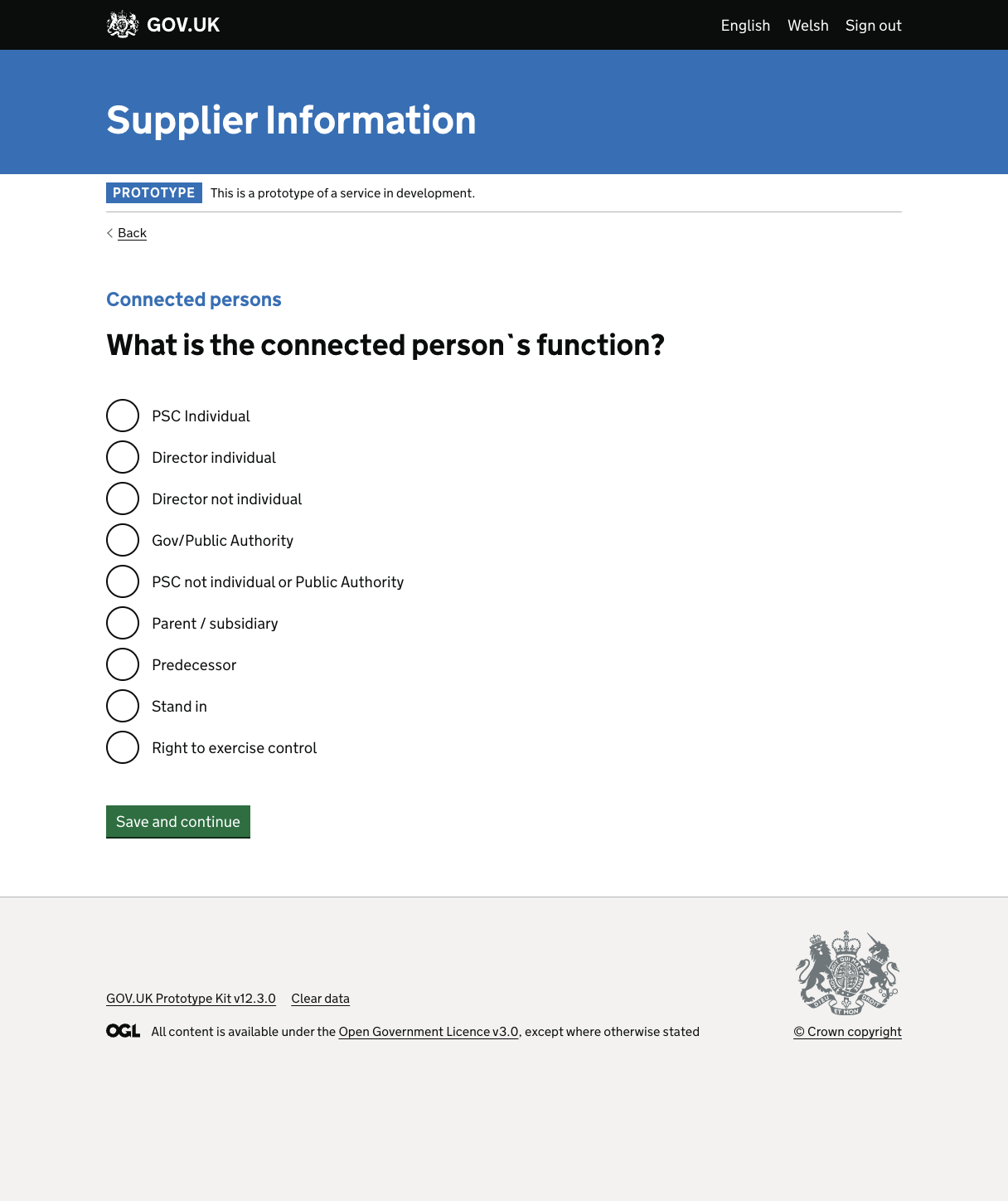
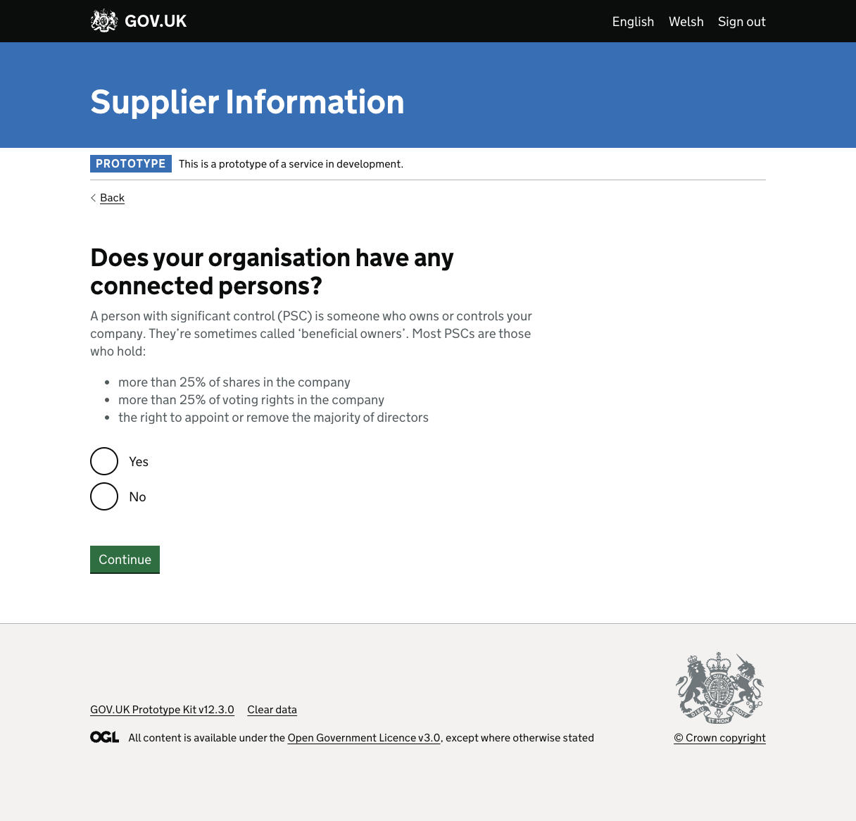
The corporate relationship mapping section of a supplier onboarding journey became a bottleneck. Every single participant in our research struggled with it, ranging from not understanding what was being requested to not understanding the terminology at all. We had assumed that subject matter experts would grasp the concept and select the right option from the nine available.
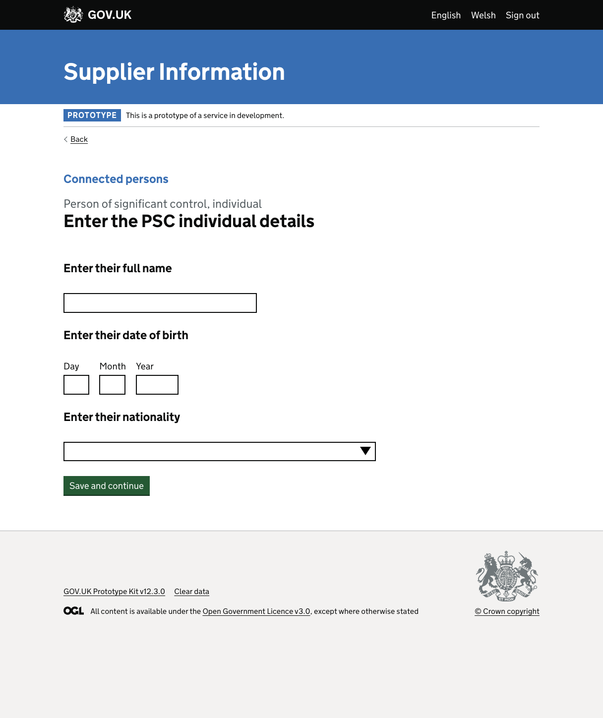
Once users selected an option, they faced a series of input fields tied to regulatory requirements. This compounded the confusion, increased time in the sub-journey, and left users with a negative view of the section overall.
Before the enhancement
Working with the constraints
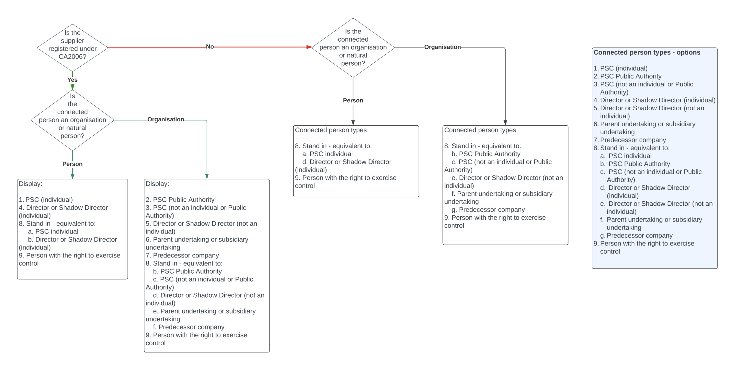
To better understand the intent behind the requirements and the paths users should take, we built a conditional logic model. The model informed the prototype and allowed us to focus on making complex compliance requirements enabling rather than frustrating.
Increasing clarity
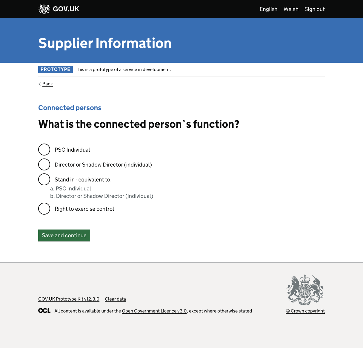
We introduced hint text where users needed extra context. After two boolean clarification questions, users now face a smaller set of options relevant to their specific circumstances, instead of nine opaque choices upfront.
After the enhancement
What we learned
When everyone fails the same way, the design has failed to communicate. The fix wasn’t more explanation layered on top, it was changing the structure: fewer options at the right moment, better labelling, and a model that made the dependencies visible before we touched the UI.